Informative Presentation of Tables, Graphs and Statistics
This is one of a series of guides for research and support staff involved in natural resources projects. The subject-matter here is the presentation of statistical information. Other guides give information on allied topics.
Contents
1. Introduction
2. Nine basic points
3. Graphs and Charts
4. Tables
5. Results of Statistical Analysis
6. Data Quality reporting
7. In Conclusion
Acknowledgement
With the permission of John Sherington, this guide has been extensively adapted from notes prepared when he was head of statistics at the Natural Resources Institute. Responsibility for the advice given now resides with the Statistical Services Centre, University of Reading.
In this guide we concern ourselves with the effective transmission of numerical information in project reports and serious publications, such as scientific papers, which might be prepared by DFID-funded researchers. We give advice on the layout of graphs, charts and tables, and on the presentation of results of statistical analyses.
For presentation of general statistical information, we recommend an authoritative source of guidance: "Plain Figures" by Myra Chapman and Cathy Wykes (1996, 2nd ed.) published by H. M. Stationery Office, a 148 page book with many full-colour illustrations. "Plain Figures" is particularly intended for those addressing non-specialist audiences; this guide sets out to reinforce and complement it, focusing on points most relevant to those presenting structured research results to an informed audience.
- Data can
be presented in the text, in a table, or pictorially as a chart, diagram
or graph. Any of these may be appropriate to give information the reader
or viewer is supposed to be able to assimilate "from cold"
while reading or listening. This objective, described as "demonstration",
is our main concern in this guide. For reference purposes, tables are
usually the only sensible option. These are usually put in an appendix,
with a summary in the text for demonstration purposes. "Plain Figures"
provides much more detail and numerous examples of reference tables.
- Text alone
should not be used to convey more than three or four numbers. Sets of
numerical results should usually be presented as tables or pictures
rather than included in the text. Well presented tables and graphs can
concisely summarise information which would be difficult to describe
in words alone. On the other hand, poorly presented tables and graphs
can be confusing or irrelevant.
- When whole
numbers (integers) are given in text, numbers less than or equal to
nine should be written as words, numbers from 10 upwards should be written
in digits. When decimal numbers are quoted, the number of significant
digits should be consistent with the accuracy justified by the size
of the sample and the variability of the numbers in it.
- In general,
tables are better than graphs for giving structured numeric information,
whereas graphs are better for indicating trends and making broad comparisons
or showing relationships.
- Tables
and graphs should, ideally, be self-explanatory. The reader should be
able to understand them without detailed reference to the text, on the
grounds that users may well pick things up from the tables or graphs
without reading the whole text. The title should be informative, and
rows and columns of tables or axes of graphs should be clearly labelled.
On the other hand, the text should always include mention of the key
points in a table or figure: if it does not warrant discussion it should
not be there. Write the verbal summary before preparing the final version
of the tables and figures; to make sure they illuminate the important
points.
- Descriptions
of the numbers represented in a table or picture should be kept as simple
as possible, while having sufficient detail to be useful and informative.
As with the original data, it is important that summaries make clear
what was measured - so there is no important uncertainty about
the definition and the units; where the data were collected -
so the extent of the coverage is clear; when - so the time period
represented is explicit; and if the data are quoted from elsewhere,
the source.
- Statistical
information, e.g. appropriate standard errors, is usually required in
formal scientific papers. This may not be necessary in articles for
a more general readership. Such statistical information should be presented
in a way that does not obscure the main message of the table or graph.
- Conveying
information efficiently goes along with economical use of "non-data
ink". For example, "perspective" should not be added
to two-dimensional charts and graphs. It impedes quick and correct interpretation.
- Tabular output from a computer program is not normally ready to be cut and pasted into a report. For example a well-laid-out table need never include vertical lines.
3.1 Line Graphs
3.2 Bar Charts
The two main types of graphical presentation of research results are line graphs and bar charts. Graphs can be small, so multiple plots can be presented on a single page or screen. Line graphs can show more detail than bar charts. They should be used when the horizontal axis represents a continuous quantity such as time spent weeding or quantity of fertiliser applied. When the horizontal axis is a qualitative factor - such as ethnic group, crop variety or source of protein - bar charts are natural. In this case, joining up points in a line graph clarifies which set the points belong to, but the lines themselves have no interpretive value: see figures below.
3.1 Line Graphs
Line graphs are useful to display more than one relationship in the same picture, for example the response to fertiliser of three different varieties. While there is no general rule, graphs with more than four or five lines tend to become confusing unless the lines are well separated. In a graph with more than one line, different line styles (e.g. solid line, dashed line etc.), colours and/or plotting symbols (e.g. asterisks, circles etc.) should be used to distinguish the lines.
In any set of line graphs, plotting symbols and line styles should be used consistently. Also, consider using the same scale on each graph, when comparisons are to be made across graphs.
3.2 Bar Charts
Bar charts display simple results clearly. They are not generally useful for large amounts of structured information. Since the horizontal axis represents a discrete categorisation, there is often no inherent order to the bars. In this case, the chart is clearer to read if the bars are sorted in order of height, e.g. the first bar represents the variety with the highest yield, the next bar displays the second highest yield and so on. The opposite direction, ascending order, can also be used. This advice has to be compromised when there is a series of charts with the same categories. In this case, it is usually preferable to have a consistent bar order throughout the series. Also in a series of bar charts, the shading of the different bars (e.g. black, grey, diagonal lines etc.) must be consistent.
It is frequently useful to "cluster" or group the bars according to the categories they represent, to highlight certain comparisons. The method of grouping should be determined by the objective of the chart.
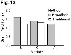
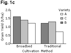
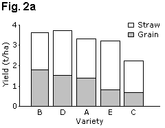
It is easier for readers to make comparisons between adjacent bars than between distant bars, and the chart should be laid out accordingly. Figure 1 gives examples of two bar charts displaying the same data. These show grain yields for six groups formed by combinations of three wheat varieties and two cultivation methods (traditional and broadbed). Fig. 1a is the better layout for demonstrating differences between cultivation methods, whereas Fig. 1c is better for showing variety differences.
  |
|
|
Table 1.
| Cultivation Method | |||
| Variety | Broadbed | Traditional | Mean |
| B | 1.59 | 1.20 | 1.40 |
| C | 1.38 | 1.30 | 1.34 |
| A | 1.20 | 0.71 | 0.96 |
| Mean | 1.39 | 1.07 | 1.23 |
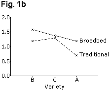
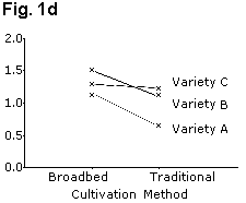
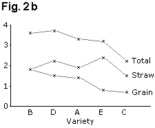
If the results need to be in a figure, then equivalent line charts, Figs. 1b and 1d use far less ink and are perhaps clearer. Similarly, the "stacked bar chart" of Fig. 2a can be presented as a line graph as shown in Fig. 2b.
"Perspective" bar charts use shading to give the illusion of a third dimension. These may be superficially attractive to some, they are not generally as clear as the equivalent simple two-dimensional chart. True "three-dimensional bar charts" attempt a two-dimensional representation of a situation where the response is plotted against two classification variables. These are harder to produce or interpret than divided or stacked bar charts and are seldom worth using; see "Plain Figures", page 76.
4.1 Tables of Frequencies
4.2 Orientation and Order
4.3 Quantitative variates defining rows or columns
4.4 Number of Digits and Decimal Places
4.5 More complex tables
The purpose of a table needs to be thought out.
( Reference tables contain information that people will look up; they serve an archival function and often need to be laid out for economy of space, while preserving data accurately. It is extremely important that they include good meta-data, the descriptive information which allow the data to be correctly interpreted - usually a comprehensive version of the "what, where and when" mentioned in 2. Reference tables often appear as appendices.
( Demonstration tables are intended to be assimilated quickly by the reader or viewer. It is important that they are clear and well-presented, using reasonable approximations to reduce numbers to relatively few significant digits. They should be included in the text: readers following a general argument tend not to bother flipping backwards and forwards.
Over-large demonstration tables are intimidating and users tend to give up on them. If the information is all necessary, it should be split into manageable components.
Omit any column which can be readily calculated from data in other columns. Minor, or not very relevant, categories can be combined.
4.1 Tables of Frequencies
The simplest tables arising from surveys, or from coded qualitative information, are of counts or frequencies. If relatively large counts are to be compared in a table with several rows and columns, it is often helpful to present them as percentages: common ways to do this involve making the percentages add up to 100 across rows, or down columns, or across the whole table. These facilitate different types of comparison, and a careful choice should be made. The sizes of sample on which a percentage table is based should be made explicit.
4.2 Orientation and Order
The orientation of a table can have considerable influence on the readability. It is much easier for a reader to make comparisons within a column of numbers than within a row. Therefore if the purpose of a table is to demonstrate differences between treatments or groups for a number of variables, the groups should define the rows of the table and the variables should define the columns. This is shown in Tables 2a and 2b. Table 2a has the wrong orientation and rows and columns should be interchanged as in Table 2b.
In addition to having the wrong orientation, Table 2a is incorrect in a number of other features. There is an unnecessary number of decimal places and this number is inconsistent within a variable. Also, the diet labels are uninformative and the variables do not have units.
In Table 2b below, the data are the same as Table 2a; except that table has been reorientated; columns and rows have been reordered to highlight differences in growth rates; the number of digits has been reduced and standardised; and more informative labels used. For simplicity here, both tables omit sample size or accuracy information.
Table 2a: Mean intakes of milk, supplement and water and mean growth rates for four diets (artificial data). The table is poorly presented.
| Diet1 | ||||
| Variable | I | II | III | IV |
| Milk Intake | 9.82 | 10.48 | 8.9 | 9.15 |
| Supplement intake | 0 | 449.5 | 363.6 | 475.6 |
| Growth rate | 89 | 145.32 | 127.8 | 131.5 |
| Water intake | 108.4 | 143.6 | 121.29 | 127.8 |
1 Diet I = Control; Diet II = Lucerne supplement; Diet III = Leucaena; Diet IV Sesbania;
Supplement | Growth
rate | Supplement intake | Milk intake | Water intake |
| (g/day) | (g/day) | (ml/kg0.75) | (ml/kg0.75) | |
| Lucerne | 145 | 450 | 10.5 | 144 |
| Sesbania | 132 | 476 | 9.2 | 128 |
| Leucaena | 128 | 364 | 8.9 | 121 |
| None | 89 | 0 | 9.8 | 108 |
The order of the rows in a table is important. In many cases, the order is determined by, for example, the nature of the treatments. If there is a series of tables with the same rows or columns, their order should usually be the same for each table. If not, it can be useful to arrange the rows so that the values are in descending order for the most important column. This is done in Table 2b. It is assumed that growth rate is the most important variable measured. The rows have been sorted so that the supplement giving the highest growth rate is first. Growth rate has also been moved to the first column. Note that if the four diets had been different levels of the same supplement (e.g. 0, 200, 400 and 600 grams of lucerne per day), then the rows should have been left in the natural order.
Also in Table 2b the labels are more informative. The row labels now give a description of the diets and the column labels include the units of measurement. The number of digits and decimal places has also been reduced and made consistent.
As a result of these very simple adjustments, the important features of the results stand out more clearly in Table 2b.
4.3 Quantitative variates defining rows or columns
The rows in Table 2b above represent qualitatively different diets. On occasion quantitative variables may be grouped and used to define table rows or columns.
| Hours weeding maize fields | Sole-crop | Intercropped with beans | Intercropped with pigeonpea | Overall percentage |
| Less than 10 | 25 | 53 | 18 | 53 |
| 10 & < 15 | 3 | 9 | - | 7 |
| 15 & < 20 | 8 | 3 | 5 | 9 |
| 20 & < 30 | 8 | 7 | 2 | 9 |
| 30 or more | 20 | 16 | 3 | 22 |
The row definitions used in Table 3 might have seemed reasonable before data collection, but far too many cases (75%) have finished up in the end categories. Maybe most of the "Less than 10" cases did 8 or 9 hours weeding, or maybe none; possibly some of the "30 or more" cases did many more hours. Possibly sole-crop maize is weeded more, but the information is too vague to be useful. If possible the table should be reworked with more meaningful groupings. Of course if these weeding categories were used in data collection the problem is irremediable. Data can be summarised; unavailable detail can't be created. This is an example where the text describing the conclusions should be drafted before the table is finalised, to check whether a table is necessary, and if so to ensure the results are clear.
4.4 Number of Digits and Decimal Places
The number of digits and decimal places presented in a demonstration should be the minimum number that is compatible with the purpose of the table. It is often possible to use as few as two significant digits. For example, in Table 2a the water intake, with values like 108.4, has three significant digits (the 1 in the hundreds column does not vary and is therefore not significant). This can be reduced to two significant digits, as in Table 2b, without any loss in information, but with an increase in clarity.
Sometimes units of measurement can be changed to make numbers more manageable. For example numbers such as 12,163 kg/ha could often be better presented as 12.2 t/ha. In other cases numbers can be multiplied or divided by factors such as thousand or one million for presentation e.g. most people would find it much quicker and easier to take in a statistic of 72 HIV deaths per 1000 population per year than a rate of 0.07189.
The number of decimal places should be consistent for each variable presented. In Table 2b water intake consistently has one decimal place and supplement intake has none. Numbers in a column should be aligned according to the decimal point.
4.5 More complex tables
The arrangement of the table below facilitates comparisons between the four breeds separately for each protein level as well as averaged over both levels. For example, we see that the first two breeds, Menz and Dubasi, have higher weight gains than Wello and Watish. Note that it would be possible to economise on space by combining the two sub-tables into a single table with two observations per cell. This may be justified in reference tables, but is not recommended in demonstration tables where it can be very confusing. Once again, the table omits sample size or accuracy information.
This kind of table cannot be used when it would need very many columns. Note that enough blank space is needed to separate the weight gain results clearly from the feed intake. Without such space this kind of table can become hard to read.
Table 4: Mean daily gain and feed intake for 4 breeds and 2 diets (artificial data)
| Weight gain (g/day) | Feed intake (g/day) | ||||||
| Protein level | Protein level | ||||||
| Breed | Low | High | Mean | Low | High | Mean | |
| Menz | 38 | 56 | 47 | 639 | 952 | 796 | |
| Dubasi | 33 | 57 | 45 | 603 | 1008 | 806 | |
| Wello | 28 | 44 | 36 | 591 | 917 | 754 | |
| Watish | 29 | 40 | 35 | 628 | 889 | 759 | |
| Mean | 32 | 49 | 41 | 615 | 942 | 779 | |
Alternative ways of presenting results like this are given in Section 5.4 in Tables 5a and 5b.
5. Results of Statistical Analysis
5.1 Descriptive Statistics
5.2 Results of Analyses of Variance
5.3 Measures of Precision
5.4 Single Factor Experiments
5.5 Factorial Experiments
5.6 Regression Analysis
5.7 Error Bars on Graphs and Charts
In formal scientific papers it is often necessary to present results of statistical analyses. They can either indicate the precision of the results, give further description of the data or demonstrate the statistical significance of comparisons.
Where statistical significance is referred to in text, the reference should be included in such a way as to minimise disruption to the flow of the text. Significance probabilities can either be presented by reference to conventional levels, e.g. (P < 0.05) or, more informatively, by stating the exact probability, e.g. (P = 0.023), usually derived from statistical packages.
An alternative to including a large number of statements about significance is to include an overall covering sentence at the beginning of the results section, or some other suitable position. An example of such a sentence is:- 'All treatment differences referred to in the results are statistically significant at least at the 5% level unless otherwise stated.'
5.1 Descriptive Statistics
When simply describing a set of data with summary statistics, useful statistics to present are the mean, the number of observations and a measure of the variation or "scatter" of the observations, as well as the units of measurement. The range or the standard deviation (SD) are useful measures of the variation in the data. The standard error (SE) is not relevant in this context, since it measures the precision with which the mean of the data estimates the mean of a larger population.
If there are a large number of variables to be described the means, SDs etc. should be presented in a table. However if there are only one or two variables, these results can be included in the text. For example:-
'The initial weights of 48 ewes in the study had a mean of 34.7 kg and ranged from 29.2 to 38.6 kg.'
or
'The mean initial weight of ewes in the study was 34.7 kg (n = 48, SD = 2.61)'.
When quoting a standard deviation (or standard error), a ( sign is irrelevant. As well as being unnecessary here, a ( sign is ambiguous if used without explanation in expressions such as 'Mean = 34.7 ( 3.6 kg'. It is not clear whether the number after the ( sign is a standard deviation, a standard error or a confidence interval.
5.2 Results of Analyses of Variance
The analysis of variance tables are primarily to help the scientist and are not normally included in a report. An exception is a specialised analysis where the individual mean squares are important in their own right. In such cases, the degrees of freedom and expected mean squares are presented.
In most situations, the only candidates from the analysis of variance table for presentation are the significance probabilities of the various factors and interactions and sometimes the residual variance or standard deviation. When included, they should be within the corresponding table of means, rather than in a separate table.
In general, authors should present relevant treatment means, a measure of their precision, and maybe significance probabilities. The treatment means are the primary information to be presented, with measures of precision being of secondary importance. The layout of the table should reflect these priorities; the secondary information should not obscure the main message of the data.
The layout of tables of means depends, as is shown below, on the design of the experiment, in particular on:-
* whether the design is balanced i.e. equal numbers of observations per treatment;
* whether the treatments have a factorial structure.
* for factorial designs, whether or not there are interactions.
5.3 Measures of Precision
The measure of precision should be either a standard error of a mean (SE), or a standard error of the difference between two means (SED), or a least significant difference (LSD). In the latter case, the significance level used should be stated, e.g. 5% LSD. The SED and LSD are usually only suitable for balanced designs. For balanced designs 5% LSD ( 2 ( SED and SED = (2 ( SE ( (one and a half) x SE.
( Only one of these three statistics is necessary and it is important to make it clear which is being used.
Our preference is for the standard error (SE). It is the simplest. We can always multiply by 11/2 or 3 to give the SED or 5% LSD, and we can use the SE for both balanced and unbalanced situations. However some scientists and journal editors may have strongly felt preferences for SEDs or LSDs and there is no over-riding reason why they need change.
Measures of precision are usually presented with one more decimal place than the means. This is not a strict rule. For example a mean of 74 with a standard error of 32 is fine, but a mean of 7.4, with a standard error of 0.3, should have the extra decimal place and be given as 0.32.
Some researchers like to include the results of a multiple comparison procedure such as Fisher's LSD. These are added as a column with a series of letters, (a, b, c, etc) where treatments with the same letter are not significantly different. Often, though, these methods are abused. The common multiple comparison procedures are only valid when there is no "structure" in the set of treatments, e.g. when a number of different plant accessions or sources of protein are being compared.
Even in such cases we suggest the method of reporting the results should be to sort the treatments into descending order of means, sorting on the most important variable. In addition a single standard error or LSD is given in the balanced case, individual standard errors in the unbalanced case. This is shown for four treatments in Tables 5a and 5b.
A few authors, and the occasional journal editor, will have severe withdrawal symptoms if told that their multiple comparison results are not required. We suggest that the results from a multiple comparison procedure are additional to, and not a substitute for, the reporting of the standard errors. If scientists find that the presence of multiple comparisons is helpful for them to write the text, then they can be included in the table at the draft stage. Once the text is written the tables should be re-examined. We find that the columns of letters almost never correspond to any of the objectives of the research and hence are not evident in the reporting of the results. Then if the multiple comparison columns are not referred to within the text, as is often the case, the tables can be simplified by eliminating them.
5.4 Single Factor Experiments
The most straightforward case is a balanced design with simple treatments. Here each treatment has the same precision, so only one SE (or SED or LSD) per variable is needed. In the table of results, each row should present means for one treatment; results for different variables are presented in columns as in Table 5a. The statistical analysis results are presented as one or two additional rows: one giving SEs (or SEDs or LSDs) and the other possibly giving significance probabilities.
| Growth rate (g/day) | Supplement intake (g/day) | Milk intake (ml/kg0.75) | Water intake (ml/kg0.75) | |
|
Supplement | ||||
| Lucerne | 145 | 450 | 10.5 | 144 |
| Sesbania | 132 | 476 | 9.2 | 128 |
| Leucaena | 128 | 364 | 8.9 | 121 |
| None | 89 | 0 | 9.8 | 108 |
| SE | 10.6 | - | 1.08 | 14.6 |
| F-test probability | <0.001 | - | 0.114 | 0.023 |
If the F-probabilities are given we suggest that the actual probabilities be reported, rather than just the levels of significance, e.g. 5% (or 0.05), 0.01 or 0.001. In particular, reporting a result was "not significant", often written as "ns", is not helpful. In interpreting the results, it is sometimes useful to know if the level of significance was 6% or 60%.
The results are the same as Table 2b with the results of the statistical analysis included. If specified contrasts are of interest, e.g. polynomial contrasts for quantitative treatments, their individual F-test probabilities should be presented with or instead of the overall F-test.
For unbalanced experiments each treatment mean has a different precision. Then the best way of presenting results is to include a separate column of standard errors next to each column of means and also a column containing the number of observations. If the number of observations per group is the same for the different variables, then only one column of numbers should be presented (usually the first column). Otherwise a separate column will be needed for each variable. An example is given in Table 5b.
If space limitations make a table like this awkward, a compromise is necessary between the amount of information presented and clarity of presentation.
| Growth
rate (g/day) | Supplement
Intake (g/day) | Milk
intake (ml/kg0.75) | |||||||||
| Supplement | n | mean | SE | n | mean | SE | n | mean | SE | ||
| Lucerne | 23 | 145 | 20.9 | 22 | 450 | 87.1 | 12 | 10.5 | 1.92 | ||
| Sesbania | 12 | 132 | 25.1 | 12 | 476 | 73.4 | 7 | 9.2 | 2.51 | ||
| Leucaena | 32 | 128 | 12.8 | 30 | 346 | 64.8 | 17 | 8.9 | 1.53 | ||
| None | 41 | 89 | 10.3 | 37 | 0 | - | 20 | 9.8 | 1.09 | ||
If there is little variation in the number of observations per treatment, and therefore little variation in the standard errors, it is sometimes possible to use an "average" SE or SED and present results as if the experiment was balanced. This should only be done if it does not distort the results, and it should be clearly stated that this procedure has been used. Alternatively, if the numbers per group are not too unequal, another method is to present the residual standard deviation for each variable instead of a column of individual standard errors.
If the groups are of very unequal size, the above compromises should not be used and the number of variables presented in any one table should be reduced.
5.5 Factorial Experiments
For factorial experiments there is usually more statistical information to present. Also the means to be presented will depend on whether or not there are interactions which are both statistically significant and of practical importance.
This section discusses two-factor experiments, but the recommendations can be easily extended to more complex cases. It also assumes a balanced experiment with equal numbers of observations for each treatment. However, the recommendations can be combined in a fairly straightforward manner with those above for the unbalanced case.
If there is no interaction then the "main effect" means should be presented. For example a 3 ( 2 factorial experiment on sheep nutrition might have three "levels" of supplementation (None, Medium and High) and two levels of parasite control (None and Drenched), giving six treatments in total. There are five main effect means: three means for the levels of supplementation, averaged over the two levels of parasite control, and two means for the levels of parasite control. In this example there would also be two SEs and two significance probabilities for each variable, corresponding to the two factors. Table 6a gives a skeleton layout for the presentation of these results.
Table 6a: Skeleton results table for a hypothetical lamb nutrition experiment with three levels of supplementation and two levels of parasite control. There is no interaction.
Factor | Final
Liveweight (kg) | Weight
gain 0 - 120 days (g/day) | Age
at puberty (days) |
| Supplement | |||
| None | - | - | - |
| Medium | - | - | - |
| High | - | - | - |
| SE | - | - | - |
| Parasite Control | |||
| None | - | - | - |
| Drenched | - | - | - |
| SE | - | - | - |
| F-test probabilities | |||
| Supplement (S) | - | - | - |
| Parasite control (P) | - | - | - |
This table could be rearranged slightly. One alternative would be to move the rows giving SEs to a position immediately above the F-test probabilities. Another would be to place the rows of F-test probabilities under the SEs of each of the relevant factors.
If there are interactions which are statistically significant and of practical importance, then main effect means alone are of limited use. In this case, the individual treatment means should be presented. A skeleton table is given in Table 6b.
For a balanced design, there is now only one SE per variable (except for split-plot designs), but three rows giving F-test probabilities for the two main effects and the interaction. Additional rows for F-test probabilities can be used for results of polynomial contrasts for quantitative factors or other pre-planned contrasts.
Table 6b: Skeleton layout for a results table for a hypothetical lamb nutrition experiment with three levels of supplementation and two levels of parasite control with significant interaction.
| Treatment | Final Liveweight (kg) | Weight
gain 0 - 120 days (g/day) | Age
at Puberty (days) | ||
| Supplement | Parasite Control | ||||
| None | None | - | - | - | |
| Drenched | - | - | - | ||
| Medium | None | - | - | - | |
| Drenched | - | - | - | ||
| High | None | - | - | - | |
| Drenched | - | - | - | ||
|
SE | - | - | - | ||
| F-test probabilities | |||||
| Supplement (S) | - | - | - | ||
| Parasite control (P) | - | - | - | ||
| Interaction (S(P) | - | - | - |
When there are one or two variables, an alternative layout is as a 2-way table as shown in Table 4. The statistical information (three F-test probabilities and, in the balanced case, three corresponding SEs) would be presented underneath the table.
When there are interactions, a graphical display is often useful, as shown in Figs. 1b and 1d. This is particularly the case when one or more of the factors are quantitative.
In situations where there is an interaction which is statistically significant but of relatively minor importance, the results can be presented as in Table 6a but with an additional row giving the F-test probability for the interaction. A comment in the text adds the necessary explanation.
When some interactions are large, the multiway table is given as in Tables 4 and 6b. The sizes of the main effects, in relation to the interaction, dictate whether it is useful to give the main effects as well, as in Table 4, or omit them, as in Table 6b.
For unbalanced factorial experiments, additional columns for numbers of observation per group and standard errors for the individual means should be added to Tables 6a and 6b, in a similar fashion to Table 5b.
5.6 Regression Analysis
The key results of a linear regression analysis are usually the regression coefficient (b), its standard error, the intercept or constant term, the correlation coefficient (r) and the residual standard deviation. For multiple regression there will be a number of coefficients and SEs, and the coefficient of determination (R²) will replace r. If a number of similar regression analyses have been done the relevant results can be presented in a table, with one column for each parameter.
If results of just one or two regression analyses are presented, they can be incorporated in the text. This can either be done by presenting the regression equation as in :-
'The regression equation relating dry matter yield (DM, kg/ha) to amount of phosphorus applied (P, kg/ha) is DM = 1815 + 32.1P (r = 0.74, SE of regression coefficient = 8.9).'
or presenting individual parameters as in:-
'Linear regression analysis showed that increasing the amount of phosphorous applied by 1 kg/ha increased dry matter yield by 32.1 kg/ha (SE = 8.9). The correlation coefficient was 0.74.'
It is often revealing to present a graph of the regression line. If there is only one line to present on a graph, the individual points should also be included. This is not always necessary and tends to be confusing, with more than one line.
Details of the regression equation(s) and correlation coefficient(s) can be included with the graph if there is sufficient space. If this information would obscure the message of the graph, then it should be presented elsewhere.
5.7 Error Bars on Graphs and Charts
Error bars displayed on graphs or charts are sometimes very informative, while in other cases they obscure the trends which the picture is meant to demonstrate. The decision on whether or not to include error bars within the chart, or give the information as part of the caption, should depend on whether they make the graph clearer or not.
If error bars are displayed, it must be clear whether the bars refer to standard deviations, standard errors, least significant differences, confidence intervals or ranges. Where error bars representing, say, standard errors are presented, then one of the two methods below should be used.
(a) the bar is centred on the mean, with one SE above the mean and one SE below the mean. i.e. the bar has a total length of twice the SE.
(b) the bar appears either completely above or completely below the mean, and represents one SE.
If the error bar has the same length for all points in the graph, then it should be drawn only once and placed to one side of the graph, rather than on the points. This occurs with the results of balanced experiments.
Tables such as 5a, 5b and 6a, 6b often include additional rows, below the standard errors giving coefficients of variation and other measures. Unlike the treatment means these statistics are normally used to assess data quality. For instance, when assessing yields, scientists might know, from past studies, that a coefficient of variation of 20% is acceptable. These statistics are the equivalent of giving non-response rates, or efficiency factors when reporting a survey. Of course they should only be included if they are accompanied by salient interpretation in the text.
Such background information can help readers to interpret the results and the effectiveness of the study design. In a scientific paper a brief reference to these aspects might be in the materials and methods, or the results section. In a project report the subject might warrant a complete section.
This type of information ought not to be supplied unthinkingly as a matter of routine. For example coefficients of variation should not be given for variables, e.g. disease scores, where they are meaningless because the measurement scale is arbitrary.
Of course it is good practice to include a wider review of factors which may have affected the relevance or quality of parts of the data, e.g. by introducing biases, and of their possible effects.
In this guide we have devoted more space to the presentation of tabular information than to the production of charts. This is not to negate the importance of charts, nor indeed the value of a clear discussion of numerical results in the text.
However tabular presentation has become the "Cinderella" method of data presentation, compared to the attention devoted to imaginative methods of graphical presentation. Tables remain important and it is through the appropriate use of all methods that research results can be reported in a way which is fair and balanced at the same time as eye-catching and clear.
Last updated 24/04/03