Excel for Statistics - Tips and Warnings
Release date: November 2000
This is one of a series of guides for research and support staff involved in natural resources projects. The subject-matter here is on-farm trials. Other guides give information on allied topics. Your comments on any aspect of the guides would be welcomed.
1. Introduction
3. Conclusions
Appendix - Excel for Pivot Tables
1. Introduction
The availability of spreadsheets that include facilities for data management and statistical analysis has changed the way people manage their information. Their power and ease of use have given new opportunities for data analysis, but they have also brought new problems and challenges for the user.
Excel is also widely used for the entry and management of data. Some points are given in this guide, but these topics are covered in more detail in a companion document, entitled "The Disciplined Use of Spreadsheets for Data Entry".
In this guide we point out strengths, and weaknesses, when using Excel for statistical tasks. We include data management, descriptive statistics, pivot tables, probability distributions, hypothesis tests, analysis of variance and regression. We give the salient points as tips and warnings. For those who need more than Excel we list some of the ways that users can add to its facilities, or use Excel in combination with other software. Finally we give our conclusions about the use of Excel for statistical work.
As an appendix we include more detailed notes about tabulation. Excel's facilities for Pivot tables are excellent and this is an underused facility.
1.1 Data Entry and Management
1.2 Basic descriptive statistics
1.3 Pivot Tables
1.4 Probability Distributions
1.5 Hypothesis tests
1.6 Analysis of Variance
1.1 Data Entry and Management
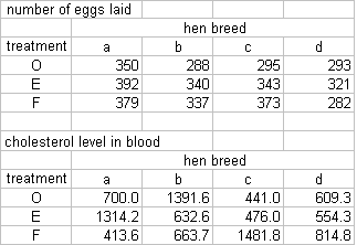
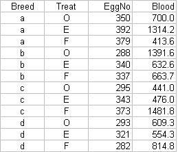
The key point on data management is to enter or organise the data so they are in Excel's "list format". The figure below shows what this means.
| This is NOT a list | This IS a list | |
| 
|
In the tips below we emphasise mainly the topics that relate to data management. There is more on facilities for data entry in our guide devoted to that topic.
| Tips | Warnings |
|
|
|
| Whenever possible use Lists to keep your data | |
| Use "names" to refer to each column of data. | |
| Keep column names short; some statistical packages have problems reading names longer than 8 characters. | |
| Do not mix data with analysis or plots in the same worksheet. | |
| If you use Excel 97 or a later version, become familiar with the facilities available for data entry under the Data menu, in particular Form and Validation. | |
| If
you need to enter character data: (1) Keep them aligned to the left (2) Do not enter blanks as the initial characters of a cell | Be aware that Excel only handles dates after 1st January 1900. |
| Use
numerical codes for any well defined classification variable,
e.g. Gender: 0 = Female, 1 = Male. | |
| Use the VLOOKUP function in combination with numerical codes to display text values attached to the numbers. | |
| Filters can be used to restrict attention to subsets of the data | |
| Sorting facilities work well for a maximum of up to 3 sorting criteria. | |
| Become familiar with the use of relative and absolute references. | |
|
|
|
1.2 Basic descriptive statistics
Excel has a large range of statistical functions that are very useful. However before you use them make sure you understand what Excel is actually returning with each function. Summary statistics can be obtained directly from these functions or else from the Analysis Tool, available from the Tools menu.
| Tips | Warnings |
|
|
|
| Functions are a very powerful features of Excel. | |
| We have found that all the statistical functions that we have used work well and reliably. | |
| Excel's graphing capability is biased towards business users. | While some Excel charts are useful for statistical work, some charts which statistical analysis use routinely are not available. |
| There are a number of pre-packed statistical tools in the "Analysis ToolPak". You may have to install this on your system. Install by selecting Add-Ins on the Tools menu. | There are some problems with terminology. For example Excel produces a summary statistic labelled "Confidence level" that is equal to half the width of a 95% confidence interval for the mean. The term confidence level is generally used in statistics to describe the % confidence attached to a confidence interval, for example 95%. |
|
|
|
1.3 Pivot Tables
The ability to summarise data in tables is very important. Excel's pivot tables are very powerful and are an area that is better in Excel than in many statistics packages. It is underused, even by those who use Excel for other statistical work. We have therefore included an appendix, that shows the use of pivot tables in more detail
| Tips | Warnings |
| This is one of the most powerful data summary tools in Excel. It produces cross-tabulations based on data kept on a list, a database or other pivot tables. | |
| Pivot tables are also useful to reorganise data as well as to provide summaries. | |
|
|
|
1.4 Probability Distributions
Excel's probability functions include all that would normally be found in a simple set of statistical tables.
| Tips | Warnings |
|
|
|
| You can use the probability functions instead of a set of statistical tables. Excel produces values for the Probability Density Function, Cumulative Probabilities and the Inverse Probability Function for many of the most commonly used theoretical distributions. | Make
sure you understand what function is being evaluated and between
which limits. If you do not understand the results given by Excel functions, Excel offers little help and could lead to wrong conclusions. For example the function for the Student's t-distribution: TDIST does not specify which probability is returned. TDIST (1.96, 10, 1) = 0.0392 The 0.0392 represents the probability of a value equal to or greater than 1.96 from a t-distribution with 10 degrees of freedom. The Excel HELP is incorrect. |
| If you understand the results of these functions, Excel can be quite a powerful tool. | The function FTEST claims to return the probability for the F value in a one-tailed test for the null hypothesis that the variances of two samples are equal. In fact it returns the result for a two-tailed test. |
|
|
|
1.5 Hypothesis tests
Excel includes tests to compare two means for paired and unpaired samples and also tests to compare two variances.
| Tips | Warnings |
|
|
|
| The hypothesis test for the differences of means, and for the variances, available from the Analysis ToolPak, work well. | We recommend against the overuse of statistical tests for one and two-sample problems. Confidence intervals are also useful. Excel gives the components from which you can calculate the intervals if you know the formulae, but it would be better if Excel gave the intervals directly. |
|
|
|
1.6 Analysis of Variance
Excel's facilities for ANOVA require the data in a tabular form as shown in section 1.1, rather than in "list" format. If you have stored the data in list format, as we recommend, then pivot tables can be used to reorganise the data, before using the ANOVA.
However, the range of designs that can be analysed is limited to one or two factors. The weakness of Excel in this area indicates that you are reaching the end of Excel's capabilities in statistics.
| Tips | Warnings |
|
|
|
| Except for Single Factor Analysis, Excel only works if the number of replications is equal in all treatments (balanced data). | |
| Does not allow missing values. | |
| Lacks flexibility in the model fitted. | |
| Encourages bad practice for data storage. | |
| Requires extra work if data have been stored appropriately. | |
| Uses incorrect names for the analysis it performs. | |
| Lacks diagnostic tools. | |
| If you need to perform analysis of variance, avoid using Excel, unless you are dealing with extremely simple problems. | Gives the impression that it is possible to use Excel for Analysis of Variance when in fact its capabilities are very limited. It is a very restrictive approach to analysing data, which is not only unnecessary but also undesirable. |
|
|
|
1.7 Regression and Correlation
Excel has facilities for simple and multiple regression. These are very limited compared to those offered in any statistics package, both in the models that can be fitted and in the diagnostics that enable the resulting equations to be examined critically.
| Tips | Warnings |
|
|
|
| Before fitting a regression line plot your data. | Do not move data points on a scatter plot. Excel will change your original values to the new position of your point! |
| The Regression tool works correctly for the estimation of regression coefficients, their standard errors and the Analysis of Variance for data sets without missing values and when the intercept is included in the model. | Ignore the ANOVA and regression statistics when using the regression tool for regression through the origin. They are wrong. |
| The regression functions, such as SLOPE, LINEST and TREND can be very useful in studies when many regressions are needed as an initial summary, for example in a "repeated measures study. The regression coefficients then become the data in the subsequent stages of the analysis. | The Regression tool allows the optional calculation of residuals, and among them standardised residuals are the most useful. However the definition of standardised residuals used is not evident either in the help or the documentation. We compared the standardised residuals from Excel with those calculated using known formulae. None of the definitions tried coincided with the one used by Excel. |
| Filters can be used to avoid observations with missing values. | Of the residual plots normally used, the two most important are plots of standardised residuals against predicted values and the normal probability plot. Neither of these is directly available in the regression tool. |
| If you need to fit regression models avoid using Excel. | |
|
|
|
[TOP]
2. Adding to Excel
The overall impression, from the tips and warnings above, is that Excel is a powerful environment for data manipulation, summary and tabulation. Its graphical facilities, though not covered in detail in this guide are also very strong. It is weaker on the more advanced statistical methods such as ANOVA and regression. In this section we explore the options that are available to users who need more statistical capabilities than are available in Excel.
The alternatives include writing or commissioning special macros, supplementing Excel's capabilities with an add-in, using a statistics package that is available as an add-in, or using a standard statistics package.
Macros can be written in VBA (Visual Basic for Applications). The power and ease of use of VBA will be a pleasant surprise to users who have programmed using languages such as Fortran or ordinary Basic in the past. The complexity will be an unpleasant surprise to those who have never programmed and are attracted to the visual simplicity of Excel. We suggest that writing macros is not as daunting as it first appears and should be considered by users who have repetitive tasks and who need to automate some of the data manipulation tasks, where Excel is already strong.
We provide a short document on our web site for users who would like to see how to write their first macro.
We caution against users who wish to write macros to improve on the weaknesses in Excel's statistical capabilities that have been mentioned above. Writing macros is addictive and can become extremely time-consuming. There is also a danger that the amateur macro writer will end by "re-inventing the wheel" yet again!
Many add-ins have been written to extend Excel's capabilities, providing boxplots, improved regression and so on. These are generally free or quite cheap and may help the user who just needs to extend Excel's capabilities a little. We provide a short document listing some add-ins on our web site.
There are also some stand-alone statistics packages that can function as Excel add-ins, but our general view is that if they are needed, then the user should also investigate combining their use of Excel, with the use of a standard statistics package.
Using a statistics package does not mean abandoning Excel. Many users do their data preparation in Excel, and then transfer the data into a statistics package for the analysis. All the standard statistics packages can read Excel files. The results can then be reported directly, or transferred back to Excel for presentation graphs to be added.
[TOP]
3. Conclusions
Excel offers an exciting environment for data manipulation and initial data analysis. Its pivot tables are particularly good for cross-tabulations and summary statistics and provide a powerful tool for basic data analysis. The reliability of more advanced statistical functions and wizards is variable.
There are some areas in which Excel can be used without reservation, such as the hypothesis tests for means, or the probability functions. However, Excel's facilities for analysis of variance or regression analysis have serious problems. Anyone attempting to perform these types of analysis should be aware of the limitations of Excel and above all of those cases where Excel generates wrong results. For regression modelling, analysis of variance and other more advanced statistical analyses it is better to move from Excel to an appropriate statistics package.
[TOP]
Appendix
- Excel for Pivot Tables
What Pivot Tables do
Creating a Pivot Table
Pivot table - Example 1
Making Changes to a pivot table
Pivot table - Example 2
What Pivot Tables do
* summarise or cross-tabulate data into tables of one, two or three dimensions
* can be modified interactively
* offer a range of summary statistics
* summarise data from various sources
Creating a Pivot Table
To create a Pivot Table, the data must be in list (database) format, i.e.
* records (cases) as rows
* fields as columns
* first row with field names
* no gaps between rows
To create a Pivot Table from data in a list:
* click on any cell in the list or database
* click PivotTable Report in the Data menu
* follow the PivotTable wizard's instructions
At Step 1 of the PivotTable Wizard choose
* Microsoft Excel or database
* followed by Next >
Step 2 will look like this ...
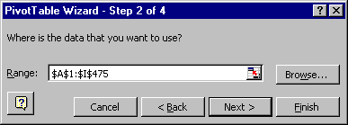
* If this is OK, confirm the data range by clicking Next >
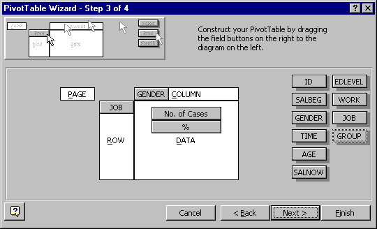
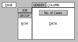
Step 3 is the main step for designing the PivotTable:
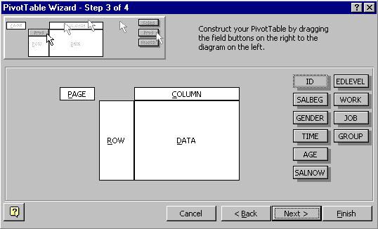
The field names appear as a set of buttons on the right.
A PivotTable can be structured into one, two or three dimensions and these are arranged in rows, columns and pages.
* The fields used for defining the table structure should be dragged into the ROW, COLUMN and PAGE spaces.
The
fields used for defining structure should normally be factors, i.e.
discrete, categorical variables (numeric, character or other types).
Using a measurement variable could produce a large table of nonsense.
The body of the table, labelled DATA, contains the variable(s) that you want to summarise in the table. The data fields will usually be numeric, but other data types are allowed, depending on what you want to summarise.
Pivot table - Example 1
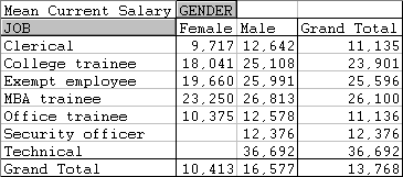
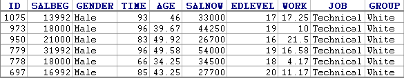
The bank employment data used to produce these pivot tables were in a worksheet containing information on 474 employees hired by a large employer. The worksheet includes the salary job category and several other human resource variables.
We go through the steps to produce a table of mean CURRENT SALARY, classified by JOB and GENDER for the bank employment data.
* Drag JOB and GENDER into the ROW and COLUMN spaces, respectively.
* Drag the SALNOW variable (current salary) into the DATA space.
The default summary statistic for numeric data is the Sum. To change this, and make other modifications,
* double-click on "Sum of SALNOW".
This opens the PivotTable Field dialog box. This is used to specify what you want to appear in the cells of the table, and how it should be formatted.
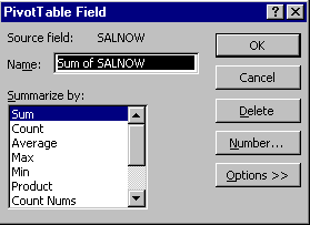
* First change the Name to "Mean Current Salary".
* From the Summarize by: menu, select Average.
* Click the Number button to open the format dialog box. Select comma-separated format with zero decimal places. (Other options available through the PivotTable Field dialog box will discussed later.)
* When you have finished specifying the field, click OK to get back to the Step 3 dialog and click the Next button.
* You will be asked where you want the table to go. Select "New worksheet" and click the Finish button.
The following table should appear in a newly created worksheet:
Making Changes to a pivot table
Most operations on PivotTables can easily be made interactively, so it is not critically important to get the table just right at the first shot.
Changing the Table Layout
* This is best done interactively, by dragging the field labels.
* It is difficult to describe but very easy to do; so is best learnt by practice.
Adding a field
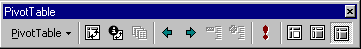
For this and certain other operations, it is best to use the tools on the PivotTable toolbar:
The first button on the toolbar gets you back to the PivotTable wizard. You can then add (or remove) fields in the same way that you constructed the table.
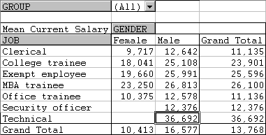
In this example, let us add a breakdown by GROUP to the table.
* First click on any cell in the table (if you do not, you will be creating a new table). Then click the PivotTable wizard button.
* Drag the field GROUP to the PAGE space and click the Finish button.
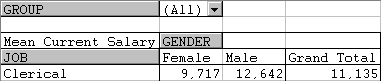
The modified table gives the breakdown of mean salary by GROUP, GENDER and JOB
* Try changing the table layout by dragging the field names into different positions.
Changing Field Properties
The second button on the PivotTable toolbar is used for editing field specifications.
The particular dialog box used for modifying a field depends on whether it is a DATA field or a structure field (ROW, COLUMN or PAGE).
* First, to make changes to a field in the table structure (i.e. ROWS, COLUMNS or PAGES), click on either the field name (e.g. GENDER), or one of its labels (e.g. Male or Female)
* Click the PivotTable Field button on the toolbar.
You should get the following dialog box:
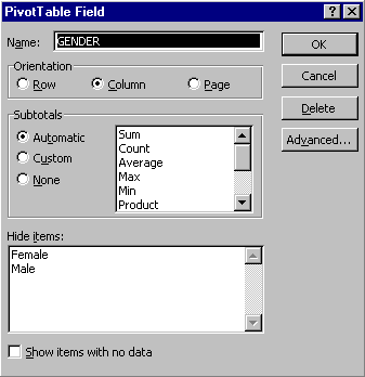
Some of the changes that can be made are:
* The field can be deleted.
* Its name can be changed.
* The orientation can be set (i.e. ROW, COLUMN or PAGE), although this can be done more easily by dragging the field names.
* The summary statistic can be changed and subtotals selected.
* The box labelled Hide items is useful if you want to restrict the table to a subset of values of the field, to exclude "Don't knows" or missing value codes, for example.
* To edit a DATA field, first click on any DATA cell (or the field name) and then click the PivotTable Field button on the toolbar. This opens the same dialog box that appeared in constructing the table. You can make changes to the summary statistic, number format, etc.
Adding or removing Totals
* First select the table.
* Choose the PivotTable drop-down menu from the toolbar, and open the Options... dialog.
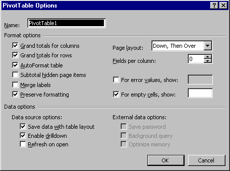
* Grand totals for rows and columns can be switched off or on from these options.
Tables of Counts and Percentages
One of the most commonly required tables is a crosstabulation of counts of cases that fall into all possible combinations of category variables. These, and the corresponding percentage tables, are easily produced as PivotTables, provided care is taken with missing values.
* To create a crosstabulation of counts, choose any field that has no empty cells as a DATA field and select the summary statistic Count. This behaves just like the spreadsheet function COUNTA(), which counts the number of non-empty cells in a range.
* There is another statistic, called Count Nums, which performs like Count, but enumerates all cells containing numbers. This statistic behaves like the spreadsheet function COUNT(). For crosstabulations it is generally safer to use Count.
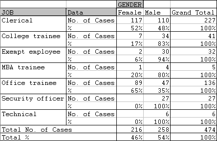
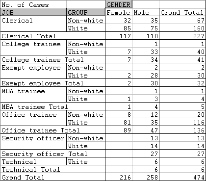
Pivot table - Example 2
To get a crosstabulation of JOB by GENDER for the bank employment data:
* First decide on a field to be used for counting. The field ID is one possibility. Check that there are no empty cells.
* In Step 3 of the PivotTable wizard, place the fields GENDER and JOB into the COLUMN and ROW spaces, respectively.
* Drag the ID field into the DATA area and double-click on it to open the PivotTable Field dialog box. Summarize by: Count and Name the field "No. of Cases".
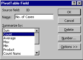
* Finishing off as in Example 1, you should get the following table:
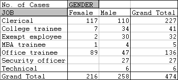
Note that zero counts appear as empty cells.
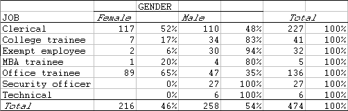
Tables of Percentages
It is often more informative to present table counts as percentages. These are usually row or column percentages, but other percentage bases are sometimes required.
To continue with Example 2, suppose we want row percentages instead of absolute counts.
* Open the PivotTable Field dialog box for the data field.
* Click on the Options>> button and look at options under "Show data as:
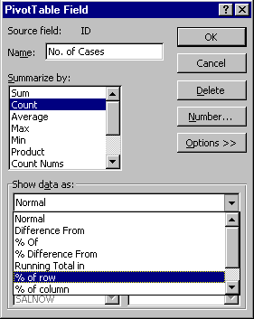
* Select % of row. Click on the Number button and select percentage format with 0 decimals. Click OK.
The result should be...
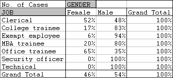
* To produce a table with both counts and row percentages, place two copies of the ID field in the DATA area of the table, one with the Count statistic, the other with "% of row"...
Here, both of the DATA fields are the ID variable, the first set up as a simple count and the second as a row percentage.
The resulting table is ...
Nesting Factors in a Table
It is possible to use two or more factors to specify rows (or the columns or pages) of a table. The effect of this is to nest the levels of each factor within those of the factor preceding it in the same dimension. For example ...
produces this ...
Formatting Tables
* To format the numbers in the cells of a PivotTable, use the PivotTable Field dialog box, as before.
* Although many standard Excel formatting techniques can be applied directly to a table, certain things cannot be done. For example, try changing the title "Grand Total".
* To have maximum formatting flexibility, make a copy of the entire table using Paste Special, Paste Values. The copy can be formatted like any other Excel range.
Here is a PivotTable after copying and formatting
Detailed Information on Table Cells
You can get a complete listing of all cases that contribute to a selected cell (or total) in a Pivot table by simply double-clicking the cell.
For example, the details underlying the selected cell in the table
are listed as ...
Last updated 24/04/03