Statistical modelling
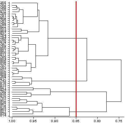
The dendogram illustrates the hierarchical cluster structure. As we move across the diagram from right to left we can see how the number of clusters increases. We can decide arbitrarily how many clusters we wish to define. We can draw by hand a vertical line (shown here in red) and position it so that an appropriate number of clusters are defined. We have chosen to separate the data into five clusters. We can see that the four 'best-bet' accessions 16803, 16786, 14984 and 16837 that fall close together in the principal component scatter diagram all appear in the first cluster. Accession number 16835 appears in the third cluster. Thus, the two analyses support each other and draw similar conclusions. |
 Study A
 ![]()
![]()
![]()