Contents
1. Importance of data explorationData exploration is the first process in the analytical treatment of data. Insufficient attention is often given to preliminary investigations of data, and researchers often jump straight into the formal statistical analysis phase of analysis of regression, analysis of variance etc. without making sure that data have been entered correctly.
Furthermore, following a series of preliminary procedures the researcher should be able to identify definite patterns in the data, gain insight into the variability contained within the data, detect any strange observations that need following up and decide how to proceed with formal analysis.
When a researcher and biometrician are working together it is often useful for the researcher to undertake some preliminary analyses first which will help him/her in his discussions with the biometrician in describing the patterns which formal data analysis needs to take into account.
Traditional teaching of biometrics often does not spend sufficient time on techniques for data exploration and description. By providing this guide, together with the accompanying case studies, we aim to emphasise the importance of this stage in the analytical process.
Sometimes application of suitable exploratory and descriptive techniques is all that is needed for the complete analysis. Case Study 11, which describes a livestock breed survey in Swaziland, is a good case in point. Most of the results are given in simple two-way tables and graphs - only a few further tests are described when it was considered necessary to provide some statistical support to the significance of results. In other cases the results were clear cut and no further statistical analysis was warranted.
Some data collected in a preliminary study of Orma Boran cattle management practices in villages in eastern Kenya Case Study 1 are similarly handled without further statistical evaluation.
This point is often neglected in statistical courses and students are left with the idea that all statistical analysis must end with a statistical test. When a result is obvious, for example when 18/20 untreated plants are infected with a fungus but none of the 20 treated plants are infected, one should not need to provide a P-value to convince a reader that there is difference.
Statistical analysis should be viewed as just one of the tools that the researcher uses to support his/her conclusions. When it becomes ridiculous to carry out a t-test, for example when the results are so clear cut, one should not need to do so. A simple description of the results, e.g. 0% of treated plants infected versus 90% of untreated plants infected should be sufficient.
The more complicated the data set the more interesting and necessary the exploratory phase becomes. With some expertise in data management the researcher is able to highlight the important patterns within the data and list the types of statistical models and their forms that need to be fitted at the next stage.
For simple studies such as a randomised block design the objectives for analysis will have been preset at the study design phase. For more complicated studies, however, the precise ways in which hypotheses are to be evaluated may need further investigation. Case Study 3 is a good example of this. The objective was to compare weaning weights of offspring among different genotypes of sheep. One of the questions posed during the exploratory phase was how best to incorporate a number of covariates collected during the study to improve the precision with which the genotype comparison could be made.
Just as for Study Design and for the modelling and inferential ideas that appear in the Statistical modelling guide there are some principles that direct the exploratory and descriptive analysis phase. These are developed below.
The aims in undertaking explorative and descriptive analysis are covered by the following activities:
Investigate the types of patterns inherent in the data.
Decide on appropriate ways to answer the null hypotheses set out at the initiation of the study.
Assist in the development of other hypotheses to be evaluated.
Detect unusual values in the data and decide what to do about them.
Study data distributions and decide whether transformations of data are required.
Study frequency distributions for classification variables and decide whether amalgamation of classification levels is needed.
Understand the data and their variability better.
Decide on which variables to analyse.
Provide preliminary initial summaries, arranged in tables and graphs, that provide some of the answers required to meet the objectives of the study.
Develop a provisional, draft report.
Lay out a plan and a series of objectives for the statistical modelling phase.
All these are illustrated in various ways by the different case studies.
In particular, one of the activities covered by Case Study 3 is to investigate how best to represent age of dam as a classification variable for incorporation in a statistical model to compare different lamb genotypes (Activity F - study frequency distributions for classification variables). Case Study 10, an impact assessment of a tsetse control trial, takes on board Activities B -ways to answer null hypothesis, and H - which variables to analyse, in helping to determine how best to use the data that have been collected. Case Study 14 tackles Activities A and B as it explores how to handle data collected in an epidemiological study of factors affecting the prevalence of schistosomiasis. Finally, Case Study 11 demonstrates the importance of Activity I - providing preliminary summaries, and how this leads to Activities B, C - developing hypotheses, and K planning further data analysis. Case Study 7 relies extensively on exploratory and graphical methods for describing pattern in rainfall in Zambia.
Activities I, J - developing a provisional report, and K - setting out a plan for the modelling phase, are particularly important tasks for the researcher during the exploratory and descriptive phase. Sometimes a study can end with Activity I (aspects of Case Study 1 and Case Study 11, for example, simply provide summary tables and charts). Even when more formal statistical analysis is required there could well be sufficient results generated to allow an initial report to be written with outlines for tables and figures provided.
This helps to rationalise the further work to be done in the statistical modelling phase. It is possible, especially in a simple study, that the only revisions that may need to be done to the final report, after all data analysis is complete, will be to fill in the contents of the tables and insert appropriate significance levels in the text.
Methods for exploring and displaying data are best appreciated by studying individual case studies (see examples in Case Study 1, Case Study 2, Case Study 3, Case Study 9, Case Study 11, Case Study 14 and Case Study 16). The various methods used in these case studies are illustrated here.
A useful place to start when describing data is to obtain lists of overall means, standard deviations, ranges and counts. This gives a useful summary, provides the first step in defining patterns within the data and is a useful stepping point for further investigation. Such summaries can be used to verify that the data set is complete and that there are no unexpected missing values.
The following table, derived in Case Study 2, provides summary statistics for the lengths of lactation of Ankole cows monitored in herds in Uganda, having previously omitted one cow with a short lactation. A quick inspection shows that the values in the table confirm that an assumption of normality is valid.
Summary statistics for LACLEN |
|
Number of observations |
= 387 |
Number of missing values |
= 0 |
Mean |
= 221.8 |
Median |
= 226.0 |
Minimum |
= 152.0 |
Maximum |
= 275.0 |
Lower quartile |
= 204.0 |
Upper quartile |
= 243.0 |
As well as providing an overall descriptive table of means and distributions it is sometimes also useful to produce one- or two-way tables of means for the key response variables. The classification variables or factors for the tables will be those associated with the primary objectives for the study. These tables will provide the first insight into the influence of these factors on the response variables of interest. Such tables can also be produced to provide maximum or minimum values or show how the standard deviation varies across different classification levels.
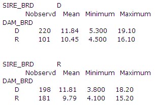
The following table taken from Case Study 3 compares the numbers of observations and means for weaning weights of lambs from Dorper (D) and Red Maasai (R) sires and dams. It provides the researcher with an idea of the magnitude of the differences in mean weaning weights between Dorper and Red Maasai lambs and their crosses.
Once a good preliminary idea has been obtained of the distributions in mean values, one might then have a look at a series of frequency tables. Once again these help to identify any missing data. They also provide further understanding of how the data are distributed.
The following two-way table in Case Study 3 looks at the distributions of births by genotype and year. The uneven distribution of births by year and genotype is apparent. It is clear that year of birth will need to be taken into account when comparing mean weaning weights among genotypes.
YEAR |
91 |
92 |
93 |
94 |
95 |
96 |
Count |
GENOTYPE |
|
|
|
|
|
|
|
DD |
71 |
49 |
49 |
15 |
23 |
13 |
220 |
RD |
73 |
47 |
54 |
9 |
9 |
6 |
198 |
RR |
0 |
7 |
31 |
40 |
53 |
50 |
181 |
DR |
0 |
6 |
34 |
15 |
22 |
24 |
101 |
Count |
144 |
109 |
168 |
79 |
107 |
93 |
700 |
The numbers of observations represented by different parameters in a statistical model are often required for reporting purposes. Frequency counts are not always provided by the software being used to carry out a statistical analysis for unbalanced data. These counts may need to be calculated separately; if so, it is useful to keep the frequency tables obtained during exploratory analysis to be referred to later.
The Excel Pivot Table facility is an excellent device for developing frequency tables, and by clicking a particular cell the records that have contributed to it can be listed. This is a good way of detecting individual outliers. The use of a pivot table is demonstrated in Case Study 8 to check that all the data have been recorded for an experiment.
A one-way frequency table can be presented pictorially in the form of a histogram. A histogram helps to visualise the shape of the distribution.
If the histogram is more or less symmetrical, with the bulk of the data gathered near the centre and the proportions of data on each side roughly balancing each other, then we can assume the data to be normally distributed. But if the data are bunched up to one side then we can say that the distribution is skewed. In this case some special action may be required at the formal statistical analysis stage.
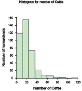
The following histogram shows how the numbers of cattle owned by homesteads in a livestock breed survey in Swaziland (Case Study 11) are skewed with the majority of homesteads having few cattle and a few homesteads several cattle.
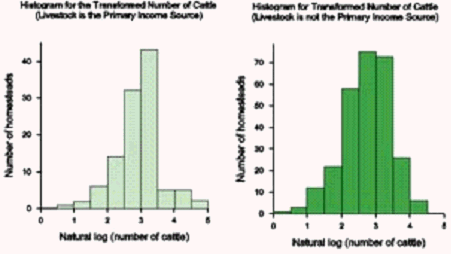
A logarithmic transformation was applied to the data. It can be seen from the following diagram, having first separated the homesteads into those with livestock as their primary activity and those not, that the distributions have become more symmetric. These may lend themselves better to statistical analysis than the former one.
Associations between two variables can be studied pictorially by means of an (x,y) scatter diagram (or scatter plot) with or without a straight line included. Scatter plots can also be used to indicate outliers and potential data errors. Excel has a useful feature for identifying outliers. By clicking a point in a scatter diagram the original record to which the point belongs can be seen.
Individual data points in a scatter plot can be numbered according to some factor or other grouping. This provides the means for assessing whether relationships are similar or parallel for different groups.
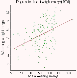
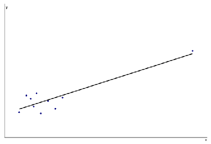
Scatter plots are produced in Case Study 3 (see below) to observe associations between weaning weight and age of lamb at weaning. A scatter plot is also used in Case Study 1 to examine associations between milk offtake and age of calf.
It is sometimes useful to plot values of a response variable on the y-axis against levels of a classification variable on the x-axis. This results in vertical columns of points and allows the researcher to investigate the distributions of individual points for each of the levels.
Box plots provide another useful way of summarising data. They display in diagrammatical form the range, mean, median, upper and lower quartiles (containing between them three quarters of the data). They also identify individual outlying points that lie beyond the range covered by most of the data. Depending on the distance of outlying points from the bulk of the data, the researcher can decide whether to investigate them further, or whether to discard or to retain them.
Box plots can also be used to assess how data are distributed and whether the distributions appear to be normal or not. By producing box plots of different groups of data side by side, an understanding can also be obtained of the ways observations are distributed not only within and but also across groups.
The following box plot, which studies the association between weaning weight and age of dam, is taken from Case Study 3. The box plot is useful in a number of ways. It illustrates the trend in weaning weight with age of dam. It shows that there are three single lambs with dams aged 1, 9 and 10 years, respectively. It also identifies lambs with weaning weights that do not conform to the overall distributions of the majority of lambs.
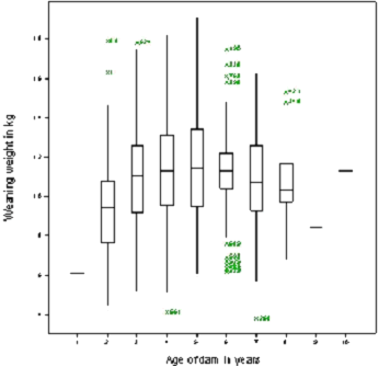
This box plot proved to be useful in showing how to group together some of the extreme ages with their neighbouring levels in order to have adequate numbers of observations per category in the subsequent statistical analysis. A frequency table could have been used instead and would perhaps have been preferable for this purpose as it provides the frequencies at each level.
A bar chart is a suitable way of expressing frequencies, mean values or proportions pictorially. These values appear as series of columns (or bars) above the horizontal axis with the height of the bar indicating the size of the value.
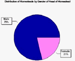
A pie chart, as the name suggests, is a circle in the shape of a pie, cut into sections to represent the proportions of an attribute assigned to different categories.
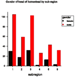
Both these methods of representation are useful for describing and presenting results (as illustrated in Case Study 11). The bar chart below compares numbers of homesteads headed by male and female heads in different sub-regions in Swaziland, and the pie chart the overall percentages of homesteads headed by males and females.
Rather than just plotting the individual data points it is sometimes useful to join them up. This helps to describe trends especially when data are collected over time. Plotting the data in this way may help to decide how to summarise data for further analysis.
The following diagram is taken from an example described in the basic biometric techniques notes produced by ILRI Biometrics Unit (2005) (p.24). It shows individual weights of cattle receiving a placebo treatment plotted over time in a vaccine trial. The graph shows that five of the animals lost weight but two gained weight during the trial. As a result of further investigation it was concluded that the two animals that gained weight had failed to be infected. This had important consequences for the statistical analysis.
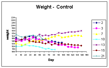
The above graph also illustrates a problem in handling data over time. Sometimes, as shown above, individuals may be removed from the study. This may, for instance, be due to death or disease. If a value of a response variable is influenced by such drop-outs, then this will likely bias the overall shape of the curve calculated at each point from those individuals that remain. This may introduce bias in the perceptions of trends exhibited by these variables and care must therefore be taken in interpreting such results.
Researchers sometimes feel that individuals that leave a study as a direct result of treatment should retain the values at that point and maintain them until the end of the study. In this way no data are lost. This, however, is dangerous and ill-advised. It is much better to take into account the timings and reasons for drop outs before deciding how to process the data and whether estimation of missing values is appropriate or not. Exploratory analysis has an important role to play in such a situation.
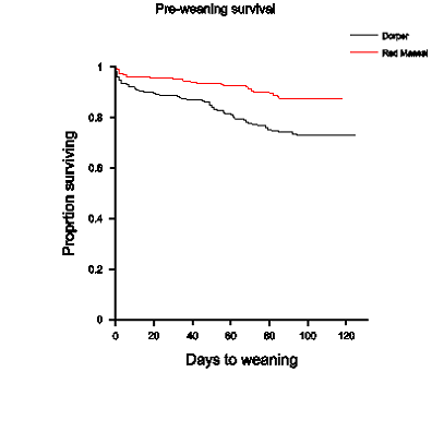
These are used to examine survival rates calculated for data based on times to a specified event (e.g. death or disease). They provide a preliminary guide in the development of models to assess survival rates. Such curves, known as Kaplan-Meier curves, show how the occurrences of events (e.g. deaths) are distributed over time. The natures of the patterns in survival rate can influence the type of survival model fitted. Such curves can also be used to identify covariates that can be included in the subsequent model.
The following Kaplan Meier curve compares the survival rates from birth to weaning of the Dorper and Red Maasai lambs that are described in Case Study 3. It shows that, not only was that death rate in Dorpers proportionally greater than that for the Red Maasai, but also that this proportion remained relatively constant over time. This is an important observation in deciding the approach to be taken in survival analysis.
The various methods described above may identify outliers, i.e. observations (or group of observations) that do not conform to the general pattern determined by the other data points. There are different forms of outliers. Some can justifiably be excluded and others not. If having checked the data sheets no obvious reasons for an unusual data values are indicated, then a decision will need to be made on whether to exclude an outlier or not.
If a data value is biologically nonsensical then it should be omitted. But in other cases the decision may be difficult. Just because a point does not conform to the pattern dictated by the other points does not mean that it is wrong. Thus, to remove a data item, just because it spoils the pattern expressed by the others and is likely to reduce the chance of a null hypothesis being rejected, is ill-advised. Identification of data variation can be as informative as the data mean. The vaccine trial example mentioned above (ILRI Biometrics Unit course notes, pp. 23-26) describes that steps that were taken in deciding whether or not to omit certain animals from the analysis. The decision was done objectively for justifiable scientific reasons.
Having decided to delete an outlier from a data set the researcher must record the fact in a note book and also state why certain observations were omitted when reporting the results of data analysis. Such a log book can also be used for writing down the various steps undertaken during the exploratory phase and for reporting the general observations made from each tabular or graphical presentation. This is essential when dealing with a complicated data set because not all the outputs will necessarily be kept. Without such care the researcher may find himself repeating earlier work.
Zeros can occur in data for a variety of reasons. They could represent missing values. For example, a yield from a particular plot in a crop experiment might be missing (perhaps recording of this particular plot was omitted by mistake or the measurement failed to be copied to the recording sheet). Or maybe an animal is removed from an experiment or a farmer does not bring his/her animal to be weighed.
It is important to distinguish between a zero that represents a genuine missing value and a zero that is a real value (see Case Study 16). It is also important to distinguish between a zero and a blank'. Sometimes a value such as -9999. that is unlikely to occur in the data is used to indicate a missing value. GenStat recognises and uses a *, for example, to indicate a missing value.
Sometimes, especially when dealing with cross-classified categorical data, one may find that cells are empty due to some structural nature of the design. Again it is important not to confuse a missing cell with a zero.
Consider recordings of daily rainfall (see Case Study 7). A zero means that no rain fell. An objective of an analysis may be related to lengths of dry spells. In this case series of zeros become significant. Such zeros also count in the calculation of rainfall totals.
Sometimes the numbers of zeros may exceed what was expected. For example 20% of farmers may have a crop failure. It is not sensible to hide this feature and might indicate that subsequent data analysis should be split into two: a study of incidence of crop failure and a study of the yields of farmers for whom crops did not fail.
A number of the outputs produced during the exploratory phase will be useful in providing basic summary descriptive statistics for the final report. Such descriptions will almost certainly include some measure of variation, typically a variance, standard deviation and/or standard error. An understanding of the calculation of the variance expressed by a number of data points is important in understanding how to express the variability displayed by the data. This topic will, of course, feature in any basic course in statistics. Nevertheless, it is an important feature to understand when presenting descriptive statistics, and those who may wish to refresh their knowledge in measures of variation may find the following description helpful.
The variance of a group of n observations y is calculated as
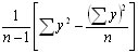
This can be written in an alternative way as

or, in words, the sum of squares of deviations of the observations about their mean divided by the degrees of freedom.
The standard deviation (often written s.d. or S.D.) is the square root of this expression. The letter s is often used to describe a sample standard deviation and the Greek letter ó to describe the population standard deviation that s (derived from the sample) is estimating. s2 and ó2 are used to describe the corresponding variances.
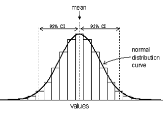
A range of a mean ± 2 standard deviations about the mean covers approximately 95% of the data when they are normally distributed. This range is described as the 95% confidence interval (C.I.). A range of a mean ± 3 standard deviations accounts for about 99.5% of the data points.
The standard error =  provides a measure of the standard deviation of a mean and is often written s.e. or S.E. The standard error can be considered as the standard deviation of a mean.
Calculation of mean ![]() ± 2 standard errors gives a 95% confidence interval within which the population mean (namely the mean that the sample mean
± 2 standard errors gives a 95% confidence interval within which the population mean (namely the mean that the sample mean  is estimating) is expected to lie if data come from a normal distribution. If data are not normally distributed the confidence interval is approximate.
The figure below illustrates what would happen if repeated random samples were taken from a normally distributed population. Each sample mean provides an estimate of the population mean but the sample means themselves also follow a normal distribution about the population mean. The distribution of means of non-normally distributed data will also approximate to a normal distribution provided the sample size is large enough.
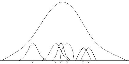
The standard deviation of the sample means represents the standard error. Of course, it would be wasteful to repeatedly take samples. The formula above uses the variance s2 derived from the single sample to calculate an estimate of the standard error.
The standard deviation/mean x 100 is known as the coefficient of variation (C.V.). This is a measure of relative variation.
The coefficient of variation of variables measured in controlled studies designed within a laboratory or on station will be found to be generally in the range of 10 and 15% or thereabouts; the more controlled a study the smaller will be the coefficient of variation. This rule does not apply, however, for all variables, especially those such as growth rate, for which individual variation can be large relative to the mean.
When planning (or analysing) an experiment, the researcher should have an idea about the coefficient of variation to expect for a particular variable within the environment that the research will be done. Coefficients of variation will be higher in studies in the field, especially when some form of farmer participation is involved, than on station. The expected magnitude of the coefficient of variation has a bearing on sample size.
It is important here to describe how these formulae needed to be adapted for surveys. Surveys are sometimes conducted to derive estimates of the size of the population from which a sample is drawn. This might be, for example, the total number of cattle in a region (as illustrated by Case Study 12) or the mean number of cattle owned per household. An estimate of the standard error also needs to be attached to give a measure of the precision with which the population total has been estimated.
The formula for the standard error is the same as that described above for the analysis of experiments except that it is now multiplied by the value (1 - f) where f = n/N. This formula can alternatively be written (N - n) / N. The formula takes into account the fact that the number of households in the sampled population is of a finite size N. As N gets larger relative to the sample size n, f gets smaller and so the expression becomes close to 1 and eventually equal to that used in experimental studies. The calculation of a standard error in an experimental study thus assumes that the population from which the sample is drawn is of infinite size.
Most surveys involve some form of clustering (see Study design guide) so that there is a multi-level type of structure to the data (Multi-level data structures). The calculation of standard errors thus becomes more complex.
We shall consider here just two layers, say a primary layer - village, and a secondary layer - household. Suppose that a sample of n villages are selected from N villages in a particular region and that mi households are sampled in village i which has Mi households. Suppose we wish to estimate how many cattle there are in the region. There are different formulae that can be used depending on how the samples have been drawn and what auxiliary information is available.
When sampling units are chosen with equal probability, for instance, the population total can be estimated as

where Yi is the total number of cattle recorded in the mi sampled households in village i. The standard error of the population total is the square root of:
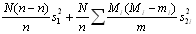
where s12 represents the variance of estimated village totals and s2i2 represents the variance of sampled households within village i. This approach is demonstrated in Case Study 12 which uses survey results to estimate cattle numbers in a region of Swaziland.
When stratification (see Study design guide) is applied to reduce the value for s12 (say, villages stratified by estimated average livestock numbers) or for s2i2 (say, stratified by household wealth within a village), the formulae look the same but with the introduction of summations over strata.
The different layers at which data are collected will have been taken into account during the design of the study (see Study design). Particular care will also be needed when the final analysis is being done (see Statistical modelling). Nevertheless it is also important to check here too the implications that multi-layer collection of data has for data analysis.
During the exploratory and descriptive phase it is important to understand the distribution of data at each layer so that appropriate methods of exploration and description are used. As one moves up the data layers one needs to be able to look at distributions in mean values summarised over the data collected at lower layers.
Alternatively, when dealing with repeated measurements, for example Case Study 10, the researcher may be interested in comparing means across different time points as well as summarising the distributions of values at each time point. Thus, processes of data exploration and description and data management need to go hand in hand.
Exploration of time trends in repeated measurement studies can also help to plan future analysis. There are advanced methods that allow the data to be analysed in their entirety in a way that allows for the multi-level data structure. Often, however, the analysis can be simplified by summarising particular aspects of the trends such as means between two points in time, the slope of the trend between two points, the value reached at the end, and so on. The simple analysis of such values might better meet the objectives of the study than that of analysing the data as repeated measures (see ILRI Biometrics Unit course notes, p.27).
The data structure will also determine how measures of variation are assessed. Case Study 12, for example, that describes how population estimates were calculated for the survey in Swaziland illustrates how, when units are clustered, the variances calculated at each layer depend not only on the variability expressed in mean values determined at the layer in question but also on the variability expressed among observations at lower layers.
When data are not distributed normally, i.e. in the form of a bell-shaped' curve, it is sometimes possible to transform them and to analyse the transformed values. Certain extreme observations may be accommodated within the main distribution of a transformed variable. Three transformations are commonly applied:
log (y + k)
![]()
![]()
The first two transformations are applied when the data are skewed to the right. The logarithmic transformation tends to be applied when the variances of different groups of observations are proportional to their means (i.e. s2 = k![]() for some constant k) and the square root transformation when their standard deviations are proportional to their means (i.e. s = k
for some constant k) and the square root transformation when their standard deviations are proportional to their means (i.e. s = k![]() ). The square root function transforms data from a Poisson distribution into data that follow a normal distribution - this is useful when the data are counts (of insects, for example). The arcsine function is appropriate for proportions which tend to belong to a binomial distribution. The distribution of the data in this case is not skewed but the shape tends to be narrower than that of the normal distribution.
). The square root function transforms data from a Poisson distribution into data that follow a normal distribution - this is useful when the data are counts (of insects, for example). The arcsine function is appropriate for proportions which tend to belong to a binomial distribution. The distribution of the data in this case is not skewed but the shape tends to be narrower than that of the normal distribution.
Section 3.4 Histograms illustrates the distribution of a variable before and after a logarithmic transformation has been applied. Although still showing some deviation from a perfect normal distribution the transformed distribution is clearly better.
Analysis of variance (see Statistical modelling) is a robust tool. It can handle slight departures from normality with little impact on the overall conclusions. Thus, it is important during the exploratory phase of data analysis to decide on how essential a transformation may be. Transformation of data can sometimes result in difficulties in presenting results in a way that they are easily interpretable by the reader. On occasion it might be worth analysing both the untransformed and transformed data to see the consequences of transformation on the results.
One of the purposes of data exploration is to investigate the manner in which data are distributed, not only to look at the overall patterns induced by a study design (for example, differences between means) but also to examine residual distributions. Various procedures have been described (e.g. box plots) that can separate variations across and within different categories. Sometimes, however, when individual data values are influenced by a number of factors it becomes difficult to separate the different types of variation through these simple exploratory tools. One then needs to resort to fitting a statistical model (Statistical modelling) and investigate the distributions of residuals there.
Case Study 1, for example, illustrates an analysis of residuals carried out by GenStat after fitting a regression model. Three comments are made on the pattern of the residuals. Firstly, two observations were identified with large residuals or deviations from their fitted values. Secondly, the assumption that the response variable had a constant variance across all data points may not have been tenable. Thirdly, some points may have had a strong influence on the directions of the regression lines.
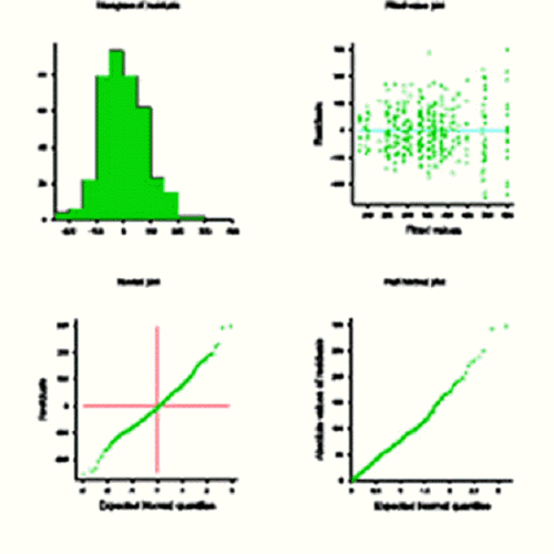
Case Study 2 provides another example and shows how different residual patterns can be examined after parameters in the model have been fitted. The output from GenStat is reproduced here. The distribution of the residuals is expressed in different ways: histogram, scatter plot against fitted values and full and half normal plots. When residuals conform precisely to a normal distribution the curves displayed in the latter two graphs will fall on a straight line.
This method is also illustrated in Case Study 15 and Case Study 16.
During the process of data exploration one should think ahead to the best ways that results can be described in the final report. This can be in any form of the tabular or graphical methods that have already been presented, for example means, standard deviations and ranges, tables of frequency counts, histograms, bar charts and so on. Case Study 11 uses, for instance, two-way summary tables, pie-charts and histograms to present results of the livestock breed survey in Swaziland. Indeed much of the data analysis for this case study did not go much further than this.
Methods of presenting results are discussed under Reporting. Graphs are often most suitably represented using the raw data and without further data analysis. Tables, however, will generally contain least squares means adjusted for other factors or covariates during the Statistical modelling phase. Standard errors will also need to be added once analyses of variance have been completed.
Nevertheless, tables of raw means can be suitably prepared before statistical modelling commences to be replaced by adjusted means later. There is also no reason why the bones of a draft report cannot be put together at this stage. This helps to streamline the process for further data analysis.
Longitudinal studies will require preliminary analyses and reports at strategic times during their execution. These may be simple summaries of means and standard errors to assess how the study is progressing and to study trends. The procedures of data validation and checking for outliers will need to be maintained as each new set of data is collected.
Certain aspects of the treatment of multivariate data are best included here since many forms of multivariate analysis tend to be of a descriptive nature, and do not quite fall into the category of statistical modelling. These are correlation analysis, principle component analysis and cluster analysis. Multiple regression, on the other hand, is disccused under Statistical modelling
Researchers are often interested in determining associations between different variables. If one such variable falls into the category of a dependent variable (y) and the others into the category of independent variables (x) then multiple regression is the method to use. In other words the researcher is primarily interested in how much of the variation in y can be explained by variation in x.
When all variables are of equal importance, without any one of them assuming special dependence on the others, then correlation analysis should be used. Correlations are suitably presented in a symmetric matrix, half filled and with the diagonals taking the value 1 (correlation between a variable and itself). A correlation of 1 implies a perfect association between two variables, i.e. all points lie on a straight line; a correlation of zero implies that there is no association. The closer a correlation is to 1 the closer is the association between the two variables.
Beware. Correlation analysis can often be misused. For example, researchers sometimes calculate correlation coefficients ignoring the data structures imposed by a study design. The interpretation of a correlation coefficient takes on a different meaning in this situation than when the correlations are based on residuals after the effects of treatment have been removed.
When the former approach is adopted the correlation coefficients could simply reflect the effect of the treatment structure on the different means for the different variables. If two variables are to be compared across treatments then mean values should first be calculated, as shown in the second experiment described in Case Study 9 for viability and germination rates for Sesbania sesban.
It is important for the researcher to recognise the experimental unit to be used for any statistical comparison. In Experiment 2 in Case Study 9 it is bud averaged over field of view that is the appropriate unit for comparing germination and viability rates, not field of view. The number of observations is thus reduced from 90 to 6. One can thus imagine the impact that a mistake in the recognition of the correct experimental unit can have on the quoted statistical significance of a result.
It is a good idea to plot the (x,y) data points prior to calculating correlations to make sure that there is a continuous spread of points. A single point that is distant from the main cluster can have a major influence on the size of the correlation and cause possible misinterpretation (see below).
Partial correlation is a term used for the correlation between two variables adjusted for the effect of another. This can be obtained by multiple regression and represents the correlation between x2 and y having first fitted x1.
Principle component analysis redistributes the variation expressed by a number of variables by transforming them into a new set of variables such that the first derived variable accounts for the largest proportion of the variation expressed among the original variables, the second variable the second largest proportion, and so on.
Often, just the two or three derived variables that account for the majority of the variation are considered. These variables are referred to as principal components. Ideally, these new variables, when expressed as a function of the original variables, have some biological meaning.
The first principal component is often a weighted average of the original variables with the other components represent contrasts between selected variables. Principle component analysis can thus be understood as rearranging the variation expressed among a number of variables into fewer dimensions. The calculations are usually applied to the correlation matrix derived from the original variables but they can also use the corresponding matrix of sums of squares and cross-products.
When transformed into the principal component dimension the individual data point principal component scores can be plotted to illustrate how the data are distributed. One principal component, usually the first, is plotted on the y-axis and another, usually the second, is plotted on the x-axis. Sometimes a principal component variable can be used as the response variable in a statistical model.
The data contained in Case Study 5 were used in a principal component analysis to identify the first two principal components for agronomic and phenotypic characteristics, respectively, of a large number of Napier grass accessions.
The aim of cluster analysis is to place data into a number of clusters or groups that maximises the variation among the clusters of data and minimises the variation within clusters. There are two general methods: non-hierarchical and hierarchical.
Hierarchical clustering starts by assigning each data point to its own cluster. The two closest clusters are then merged into a larger cluster, then the next pair of closest clusters and so on. The process is continued until all the units have been formed into a single cluster.
Before calculating 'closeness', a formula for defining the distance between individual points, needs to be defined. There are various methods for defining 'distance'. Most measures assume the data to be quantitative in nature - the one that is most commonly applied for quantitative data is the one known as 'Euclidean distance'. All the individual distances can then be put into what is known as a 'similarity' matrix. It is this matrix that is then used for the clustering.
An alternative measure, known as 'Gower's similarity index' is able to accommodate both nominal and ordinal (or quantitative) variables.
Before applying cluster analysis it is important to check on the types of variables to be used in the analysis to ensure that a suitable distance measure is being applied.
There are different algorithms that can be used for defining closeness between clusters. For example, a method known as the 'single linkage' method defines the distance between two clusters as the distance between their closest neighbouring points. On the other hand the 'average linkage' method uses the average distance between all possible pairs of points.
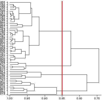
The clustering is displayed diagrammatically in the form of a 'hierarchical tree' or 'dendogram' so that the investigator can see how the different clusters are formed. The investigator can then draw a line across the dendogram where he/she feels that an appropriate number of clusters has been formed that allows suitable discrimination between groups of points.
The data contained in Case Study 5 were also used to apply cluster analysis to place several accessions of Napier grass into similar categories. The diagram below shows how the dendogram for agronomic characteristics was formed in GenStat. A vertical line has been drawn to separate the data into a suitable set of reasonably distinct clusters.
Another application of cluster analysis is described in Rowlands et al. (2005) who used the method to attempt to use phenotypic data to identify different breeds of cattle and their distributions in Oromiya Regional State in Ethiopia.
Non-hierarchical cluster analysis, on the other hand, groups the data into a pre-determined number of groups. An iterative procedure is followed swapping units from one group to another until no further improvement can be made.
One of the primary aims of the exploratory phase is to define precisely any further formal analyses that need to be done. By doing this well it should be possible to complete the formal data analysis phase quickly and efficiently. Of course, it may be that no further analysis is required. For example, principal component or cluster analysis may be all that is necessary for the analysis of a particular data set.
A second aim is to identify those variables that need to be included in the statistical models to be fitted, and to decide in what form the variables should be presented. At the same time the researcher needs to ensure that the model fulfils the objectives and null hypotheses that were defined when the study was planned.
There may be additional covariates that need to be included in the model to account for some of the residual variation. Decisions also need to be made on how complex a model should be. This will depend on the sample size and the degree of uncontrollable variation evident within the data.
A set of objectives for the statistical modelling should be prepared before moving onto the modelling stage. These will include
As already indicated, a list of possible tables and graphs that might be appropriate to include in the final report will have been usefully prepared by this time too.
As has already been mentioned, it is often difficult during the data exploration phase to examine different patterns simultaneously across more than one grouping of the data. It is only when adjustments are made for the presence and levels of other factors or covariates in a model that the real patterns between the response variable and the primary independent variables of interest become absolutely clear. The sizes of different interactions may also be difficult to foresee.
Sometimes completion of the formal statistical modelling phase may suggest new patterns as yet unexplored. The researcher may wish to return to the data exploration phase study these patterns further.
Users who feel they need to be reminded about, or need to familiarise themselves with, elementary statistical methods that may not be covered in sufficient detail in this Teaching Guide may find the course notes written by Harvey Dicks (Dicks H.M. 2006a) for students at University of Zwazulu-Natal helpful.