Contents
1. Good report writing
2. Describing statistical methods
3. Presenting numerical results
4. Tables
5. Graphs and charts
6. Presenting statistical significance
7. Descriptive statistics
8. Analysis of variance
9. Standard errors
10. Factorial designs
11. Regression analysis
12. Error lines on graphs and charts
13. Logistic regression
14. Log linear models
15. Survival analysis
16. Principal component and cluster analysis
17. Other methods of reporting
18. Reviewing reports
19. Writing tips
20. Ethical considerations in reporting
21. Common statistical abbreviations
22. Related reading
23. Acknowledgement
When looking at a research article for the first time, a reader will generally first read the abstract or summary. If this looks interesting he/she will then glance at the tables and figures; if they are informative then he/she may start to read the text itself. Consequently, good, clear, concise reporting is essential in all aspects of the report if the results of research are to make impact. There is no value in designing a good study, doing it well, managing the data well and performing the analysis correctly if the report itself is poor. Good reporting, however, is a skill that does not come easily - lots of practice is required.
Scientific reports generally include an 'Introduction' section setting out the background to the research and defining the purpose of the particular study, a 'Material and Methods' section describing the way that the study was designed and the analytical methods applied, a 'Results' section that summarises the outcome of the study and a 'Discussion' section that discusses the results in the light of other published work.
Less formal reports will often need to be structured in a similar way though the author can afford to be a little more flexible in the headings that are used.
Sometimes, especially when a paper is short, Results and Discussion sections are merged. In most cases, however, they are better kept apart. Although an author has more freedom in preparing a less formal report, it is generally useful to keep the structure of the more formal scientific paper in mind.
When preparing a report it is usually best to first prepare drafts of the tables and graphs to be included, and decide on what they should contain. Much of this can often be done on completion of the Exploration & description phase. Once the tables and graphs are ready the text for the Results section can be written.
The Discussion section can generally be left to the end, and also the Abstract or Summary. The author should refrain from discussing results in the Results or, as occasionally happens, in the Materials and Methods. Discussion points should be delayed for the Discussion.
The Results section is the most important section as this contains the tables and the graphs that describe the results. The text must be concise, clear and unambiguous, and allow the key points to be understood. It is often helpful to include sub-headings to separate one topic from another. Some tips for concise writing are given later under Writing tips.
This guide refers extensively to a publication by Bealby, Connor and Rowlands (1996) which describes a series of experiments studying the impacts of different methods of control of trypanosomosis in goats in Zambia. This publication provides suitable illustrations of much that is discussed in this guide.
The task of the biometrician, or the researcher providing the statistical expertise, is to ensure that the hypotheses being tested in a study are clearly laid out, that the statistical methods are presented accurately, completely and concisely, and that the results are described and interpreted in a way that addresses the original hypotheses.
When planning a study researchers will often presume that the outcome will reject the null hypothesis. Consequently they may tend sometimes to bias the interpretation of the results in their favour. The biometrician must not be influenced by a researcher's desire to achieve a positive outcome from a study. There is nothing wrong with a negative result.
The Discussion will often include suggestions for further research. Some might be taken up within the current project itself. It is possible that sometimes results from one study can influence the subsequent course of the research process. The biometrician's skills in lateral and objective thinking are important in making sure that there are no ambiguities in the way that results are discussed and that they are not over-interpreted.
The results from one experiment often help to guide plans for the next. A 'negative' conclusion may not necessarily be seen as the final conclusion but rather an opportunity to redesign the experimental treatments and try again. The results of the study may thus influence the direction of the Research strategy and the biometrician, using his ability to think both objectively and laterally, can contribute positively to the research debate. Thus, reporting should not only be considered as the end product of a study but also one that provides ideas for the next phase of the research.
The statistical analysis section is usually contained within the Materials and Methods section. This is not always easy to write and a researcher may often wish to seek the help of a biometrician. The section must be written in a way that allows a reader, with a reasonable appreciation of statistics, to understand how the statistical analysis was conducted so that he/she can judge for him/herself on its suitability for the study being described.
It is usually simplest, when straight forward analytical procedures have been used, to describe the analytical process in words, for instance "The data were analysed by analysis of variance with terms for supplementation, parasite control and their interaction." To say simply that "The data were analysed by Genstat" is insufficient, though it may be useful to state which statistical software was used.
An example of how statistical methods applied in a regression analysis of milk offtake in a survey of village cattle in Kenya can be written is given in Case Study 1. Various other descriptions of statistical methods used in the analysis of a number of experiments are given in Bealby et al.
In more complicated cases it may be easier to express the model algebraically. for example, "The data were analysed by analysis of variance using the model:
yijk = µ + si + pj + (sp)ij + eijk
with yijk the response variable, si (i=1,..,3) level of supplementation, pj (j=1,2) level of parasite control, (sp)ij the interaction between supplementation and parasite control and eijk the error (or residual) term for lamb ijk."
Numerical results should as far as possible be presented in tables or graphs. Sentences become difficult to read if too many numbers are included. Well presented tables and graphs can concisely summarise information which would be difficult to describe in words alone. Poorly presented tables and graphs, however, can be confusing or irrelevant.
Tables are usually better than graphs for giving detailed numeric information, whereas graphs are better for indicating trends and making broad comparisons.
Tables and graphs, as far as possible, should be self-explanatory. The reader should be able to understand them without referring to the text. The title should be informative. Rows and columns of tables and axes of graphs should be clearly labelled and kept as simple as possible, while having sufficient detail to be useful and informative.
Statistical information such as standard errors and significance levels will be expected in formal scientific papers. These are not so necessary for talks or for articles intended for a more general readership.
Statistical information should be presented in a way that will not obscure the main message of the table or graph. It should also be prepared with the general expected educational level and background of the audience in mind.
Large tables are intimidating and tend to be ignored by readers, unless they are aimed at organisations that need to see the full statistics tabulated. If the text makes frequent comment on the substance of a particular table, the table should, where possible, be split into manageable components. If a large table is necessary for reference purposes, it can be relegated to an appendix.
The orientation of a table can influence its readability. It is easier for a reader to make comparisons vertically within a column of numbers than horizontally within a row.
If the purpose of a table is to demonstrate differences between treatment groups for a number of variables, it may be better to arrange the table so that groups are defined as rows and the variables as columns. This is shown in Tables 1a and 1b, which are adapted from an experiment conducted by the International Livestock Centre for Africa (ILCA) some years ago in The Gambia.
The tables describe the effect of supplementation with sesame cake in the feeding of cattle in The Gambia at different periods of time over the dry season on milk offtake, calf growth rate, cow body weight loss and packed cell volume in 25 N'Dama cows per treatment group.
Table 1b has the preferable orientation.
Often there may be too many variables to put into columns. In this case the orientation of Table 1a becomes necessary.
Table 1a. Orientation is by variable (rows) and dietary group (columns).
Dieta | ||||
Variable |
I |
II |
III |
IV |
Milk offtake |
69.14 |
116.3 |
131.9 |
120.5 |
Calf growth |
107.3 |
157.4 |
143.0 |
133.4 |
Cow body weight loss |
232.4 |
157.3 |
150 |
148.9 |
Packed cell volume |
25.61 |
27.73 |
28.28 |
27.96 |
a Diet I = Control; Diet II = supplemented 1000 g/d (January - March); Diet III = supplemented 1000g/d (April - June); Diet IV = supplemented 500 g/d (January - June).
Table 1b. Orientation is by dietary group (rows) and variable (columns).
|
Supplement |
Milk offtake |
Calf growth rate |
Cow body weight loss |
Packed cell volume (%) |
0 |
69 |
107 |
232 |
25.6 |
1000 g/d (Jan - March) |
116 |
157 |
157 |
27.7 |
1000 g/d (April - June) |
132 |
143 |
150 |
28.3 |
500 g/d (Jan - June) |
120 |
133 |
149 |
28.0 |
Table 1a, in addition to having the wrong orientation, has a number of other poor features. There are unnecessary numbers of decimal places and the number of decimal places is inconsistent within a variable. Also the different diets cannot be recognised without referring to the footnote, and the variables do not have units. The use of Roman numerals I, II etc. is also a little disconcerting and could give the impression of some form of blocking or replication; letters A, B, C, D might be better.
The order of the rows in a table can also be important. In many cases the order will be predetermined by, for example, the nature of the treatments. Thus, for example, a control treatment might be placed first, or last.
If a series of tables is being prepared, and each table contains equivalent rows, the row order should as far as possible be the same for each. The same applies to column order.
If there is no predetermined order, it can be useful to arrange the groups so that the values for the first, and presumably the most important, variable are in descending order of magnitude. This has not been done in Table 1b, however, as the dietary groups are given in the more appropriate order of increasing supplementation, with the control group first, and with the other dietary groups following.
Finally when presenting a table it is very important that the table is self-explanatory - in other words the reader can understand the contents of the table without reference to the text in the report. The table therefore needs a title that describes the contents fully. A suitable title for Tables 1a and 1b might be:
The effect of supplementation with sesame cake in the feeding of cattle in The Gambia at different periods of time over the dry season on milk offtake, calf growth rate, cow body weight loss and packed cell volume in 25 N'Dama cows per treatment group.
The reader can refer to the article by Bealby et al. to find various examples of how tables are described in that report. Case Study 15 illustrates how mean yield results from a factorial experiment can be presented when there is no interaction between dry bean cultivars sown at different spacings.
The numbers of digits and decimal places should be the minima that are compatible with the purpose of the table. It is often possible to use as few as two significant digits. For example, milk offtake is presented in Table 1a with four significant digits. The number of significant digits can be reduced, as shown in Table 1b, without any loss in information, and with an increase in clarity.
When selecting the number of significant digits to present, account must also be taken of the precision with which measurements are made and the general range in values that might be expected. Thus, if a measurement is made in whole number units (for example, animal body weight) it would be reasonable to present a mean with one but certainly not two decimal places. Further discussion of suitable numbers of decimal places for presentation in a table is given in Case Study 3, which reports on a least squares analysis of factors affecting weaning weights of Dorper and Red Maasai lambs.
Sometimes units of measurement can be changed to make numbers more manageable. For example numbers such as 12,163 kg/ha can often be better presented as 12.2 t/ha. In other cases numbers can be multiplied or divided by factors such as a thousand or one million for simpler presentation e.g. numbers such as 0.00429 could be presented as 4.29 with a suitable adjustment to the column label to indicate that numbers had been multiplied by 1,000 for presentation.
The number of decimal places should be consistent within each variable, although, of course, different variables can have different numbers of decimal places. Thus, milk offtake is shown to consistently have no decimal places in Table 1b, and packed cell volume one. Numbers in a column should be aligned according to the decimal point.
Table 1b presents results for a number of variables for which the data are classified by one group or factor. If the data are classified by two factors, and there are only results for one or two variables, a more complex table may be useful.
Table 2 shows an example of a table reporting results from a factorial experiment involving different breeds of sheep. Within each breed some animals were fed a low protein diet and others a high protein diet. The two main variables are average daily gain and average daily feed intake for a 240-day period.
Table 2. Mean daily gain and feed intake for four breeds of sheep fed two different levels of protein intake (artificial data).
Weight gain (g/day) |
Feed intake (g/day) | ||||||
Protein level |
Protein level | ||||||
Breed |
Low |
High |
Mean |
Low |
High |
Mean | |
Menz |
38 |
56 |
47 |
639 |
952 |
796 | |
Dubasi |
33 |
57 |
45 |
603 |
1008 |
806 | |
Wello |
28 |
44 |
36 |
591 |
917 |
754 | |
Watish |
29 |
40 |
35 |
628 |
889 |
759 | |
Mean |
32 |
49 |
41 |
615 |
942 |
779 | |
This arrangement of the table facilitates separate comparisons between breeds for each diet, as well as permitting comparisons averaged over diets. Similarly, it allows comparisons between diets, not only for each breed but also averaged over the four breeds. A further example is given in and Case Study 16 in which mean yields of three taro races are tabulated against three dates of planting.
Tables are sometimes tricky to prepare when reporting results of surveys and there is the possible danger of them becoming overcomplicated. Case Study 11 and articles by Kosgey (2004) and Rowlands et al. (2003) show how tables of survey results can be presented.
When proportions are presented it important to ensure that the appropriate column of frequencies used as the denominator for the calculation of proportions is included. Case Study 11 includes an example of a table that includes both the total count of homesteads and the numbers of categories of homestead members involved in cattle activities in Swaziland. The latter was the relevant denominator used for the calculation of the proportions presented in the table.
The two main types of graphical presentation of research results are line graphs and bar charts. Pie charts can also be used, and also scatter diagrams. In general, line graphs can show more detail than bar charts.
Line graphs should be used when the horizontal axis represents a continuous quantity, for example, time, age, or a changing amount of a quantity, such as supplement fed or fertiliser applied. Line graphs should not be used when the horizontal axis represents discrete categories that fall in no logical order, such as animal breed, crop variety or source of protein. Such data need to be presented as a bar chart.
Graphs or charts should not replicate in graphical form the contents of a table. Graphs and tables should be used to present results that complement each other.
Line graphs are very useful for displaying more than one relationship in the same picture, e.g. the response to fertiliser of three different varieties. While there is no general rule, graphs with more than four or five lines tend to become confusing unless the lines are well separated.
Different line styles (e.g. solid line, dashed line etc.) and/or plotting symbols (e.g. asterisks, circles etc.) can be used to distinguish different lines. When a series of similar graphs are being prepared, the plotting symbols and the styles of the lines should be used consistently. Provided that there are not too many data points to clutter the picture these are often usefully displayed as well to indicate the degree to which the data are scattered.
Fig.1 taken from page 63 in Chapter 7 of Bealby et al illustrates mean results presented both in line and bar forms. The graph also shows how the left and right vertical axes can be used to describe two different variables presented together in the same figure. Notice how each line, which represents changes in mean rectal temperature over time, is plotted using a different line style. Different shadings are also used for the bars that show corresponding changes in mean prevalence of trypanosomes (the parasite that causes the disease) over time. Using lines for one variable, and bars for another, helps with the visual representation of the results.
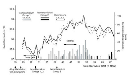
Fig 1. Changes in mean rectal temperature and in prevalence of trypanosome infection in female goats protected (Groups 1 and 2) and unprotected (Group 3) against trypanosome infection with isometamidium chloride.
Axes need to be clearly labelled and only the necessary number of points marked on the scales that are sufficient to allow the reader to be able to conveniently interpolate between one mark and the next. Axes with too many scale marks make the picture look complicated and provide more detail than is necessary.
Careful choice of the ranges of values displayed by axes is also important, and, when a series of graphs is being presented with the same x- or y-axis, then each graph should, as far as possible, have the same axis scale. If not, the reader can be deceived by the variation of one variable appearing to be wider in one graph than it actually is.
It is not necessary that axes start at zero (see Fig.1); data may include negative values or be located far above zero to make inclusion of the zero origin impracticable. A non-zero origin is quite acceptable, provided it is clearly marked as such. Alternatively, a zero origin may be included but a portion of the scale shown to be omitted with a squiggle drawn along the axis from the origin to join with the remainder of the axis.
A scatter diagram is useful (with or without a regression line superimposed) when the main purpose is to illustrate the association between two variables (see, for example, Case Study 1).
Fig.2, taken from page 72 of Chapter 8 of Bealby et al. gives a simple representation of the association between average weekly incidence of infection in goats, protected or unprotected against trypanosomosis. Here the interest is in knowing to what extent protection reduced incidence (shown by the slope of the line). Thus, infection incidence for protected goats (dependent variable) is presented on the y-axis and infection incidence for unprotected goats (independent variable) is presented on the x-axis.
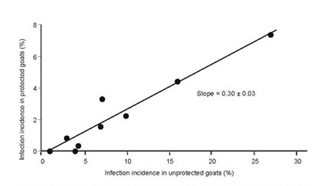
Fig. 2 Relationship between average weekly incidence of infection in adult female goats 'protected' and 'unprotected' with isometamidium chloride
Inclusion of the individual points shows their scatter both across the range of infection incidence and about the regression line.
When only the association (correlation) between two independent variables is to be illustrated a regression line is not necessary
An illustration of the use of a bar chart for continuous data has been shown in Fig.1. The reader is also referred to Case Study 15. Bar charts are in addition especially useful for simple descriptive presentations of discretely categorised data when there is no inherent order to the bars. If one of the groups is a control group then it may be sensible to put this first, or last.
Alternatively, a bar chart may be clearer to read if the bars are sorted in height order, e.g. the first bar represents the variety with the highest yield, the next bar the second highest yield, and so on. The opposite direction, i.e. ascending order, can also be used. When a series of bar charts is being prepared with the same categories, the bar order should be consistent throughout the different charts. Any shading of the bars (e.g. black, grey, diagonal lines) must also be consistent.
It may also be useful to 'cluster' or group the bars according to the categories they represent in order to highlight certain comparisons. The method of grouping should be determined by the comparisons to be made. It is much easier for readers to make comparisons between adjacent bars than between distant bars, and the chart should be laid out accordingly.
Fig. 3 gives examples of two bar charts displaying the same data. These show grain yields for six groups formed by combinations of three wheat varieties and two cultivation methods (traditional and 'broad bed'). The first presentation is the better layout for demonstrating the overall differences between cultivation methods, whereas the second is better for showing overall differences among varieties.
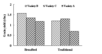
Fig.3. Alternative forms of presentation of the same data for grain yield of three different varieties using two different cultivation methods.
A method for displaying more complex information on a bar chart is to 'stack' the bars. Fig. 4 gives an example of such a chart. It shows grain yield and straw yield for five wheat varieties. The varieties are sorted according to their amount of grain yield.
While this graph is good at displaying grain yield and total yield (i.e. grain + straw), it is poor at displaying straw yield alone. For example, it is not at all obvious that variety E has the highest straw yield. If the amounts of grain and straw yield are equally important, then Fig. 4 is not a particularly suitable form of presentation.
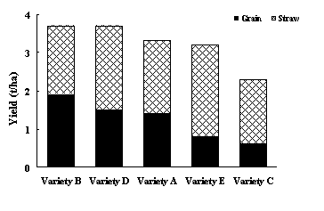
Fig. 4. Comparisons of grain and straw yields produced by five different varieties of wheat.
Three-dimensional bar charts are relatively easy to produce by computer. While these may be superficially attractive, they are not generally as clear as the equivalent simple two-dimensional chart. They should normally be avoided.
As far as possible one should refrain from including levels of statistical significance within tables. Examples are given below of bad practices that sometimes tend to feature within the literature.
Table 1c is typical of tables sometimes seen cluttered with little superscripts a, b, ab, c, etc. One should always ask oneself whether these are really necessary, as they tend to obscure the main ingredients of the table. Such tables also tend to impose the author's own views on the readership.
In rare cases it may be felt that these are necessary and help with the understanding of the table. But think twice before doing this. Normally tables are much better if they are simple and present the data at their face value.
Table 1c. The results are the same as Table 1b (see Tables) with details of statistical significant differences included. Such details are NOT recommended.
|
Supplement |
Milk offtake |
Calf growth rate |
Cow body weight loss |
Packed cell volume (%) |
0 |
69a |
107a |
232a |
25.6a |
1000 g/d (Jan - March) |
116b |
157b |
157b |
27.7b |
1000 g/d (April - June) |
132c |
143bc |
150b |
28.3b |
500 g/d (Jan - June) |
120bc |
133c |
149b |
28.0b |
a,b,c Values containing the same superscript are not significant (P>0.5).
Table 1d demonstrates an alternative method of illustrating significant differences by using *s to signify significant differences (conventionally *: P<0.05; ** P<0.01; *** P<0.001). Sometimes asterisks may be useful in more complicated tables where their use can aid interpretation.
But they are not recommended for a situation as Table 1d where they are unnecessary and tend to impose the view of the author on his/her readership as to what is or is not significant.
Table 1d. The results are the same as for Table 1c but asterisks have been inserted instead of the letter superscripts to signify statistical significance of means compared with the control:* P<0.05,** P<0.01, *** P<0.001. Again this is NOT advised.
|
Supplement |
Milk offtake(l) |
Calf growth rate(g/day) |
Cow body weight loss (g/d) |
Packed cell volume (%) |
0 |
69 |
107 |
232 |
25.6 |
1000 g/d (Jan - March) |
116*** |
157*** |
157*** |
27.7* |
1000 g/d (April - June) |
132*** |
143** |
150*** |
28.3** |
500 g/d (Jan - June) |
120*** |
133* |
149*** |
28.0** |
When an author does consider that asterisks will be useful, he/she should be sure that their inclusion does aid interpretation. Statistics is only a tool to aid the drawing of inferences from data, and the author has a duty to allow his/her readership to make their own judgments as to the 'significance' of his/her results.
Means and standard errors are often the only statistics required. Thus, Table 1b (with the addition of SEDs - see Table 1e later under Standard errors) is to be preferred. The reader should also be able to draw his own conclusions from the data presented in a table on how 'significant' he/she feels they are. Provided that standard errors or standard errors of differences are included, he/she can always do simple mental arithmetic to calculate the least difference for two means to be significant (e.g. 2 x SED with 2 the approximate 95% t-value).
An indication of statistical significance is better placed in the text and included in such a way that it does not disrupt the flow of a sentence. Probability values are often most conveniently placed at the end of a sentence or phrase (see Case Study 1). Significance probabilities can either be presented by reference to conventional levels, e.g. (P<0.05), (P<0.01), (P<0.001) or, more informatively, by stating the exact probability, e.g. (P=0.2). It is not necessary to go below (P<0.001), e.g. (P<0.0001).
When a comparison is not statistically significant it is quite in order to give the probability level (e.g. P=0.07). To save frequent (P<0.05) statements it is possible to insert a statement at the front saying: "All treatment differences described in the Results are statistically significant at least at the 5% level, unless otherwise stated."
What should be the conclusion when two means are compared and the t-value just fails to reach statistical significance (P=0.06, for instance)? Should the comparison be ruled out as non-significant? One could argue, for instance, that such a difference is hardly less significant than that which would have occurred if the 'magical' P=0.05 value had been reached. It will also depend on how well the null hypothesis that is being tested has been defined - whether it was defined at the study planning stage or has arisen during the analysis.
Some researchers tend to view statistical testing in the form of a jockey tackling fences in a steeple chase. When the researcher clears the P=0.05 fence he jumps with glee. If he/she clears the next one (P=0.01) he is even more excited, and, if the P=0.001 fence is cleared, well he/she is ecstatic.
The art of drawing statistical significance should not be viewed as part of a significance fishing expedition. One should instead take the results at their face value and, if differences are considered to be of biological significance and worth reporting, then the P-value should be stated, even if it falls short of significance.
When the phrase 'there was no significant difference' is reported, it does not necessarily mean that there were no differences between treatments. It just means that no significant difference was found within the experiment that was conducted.
The aim of a scientific investigation is to estimate, by conducting a carefully planned study, the mean response to treatment, whether it be an application of a fertiliser, a vaccination or some other intervention. The aim of a survey is usually to estimate population means or to determine the effects of certain factors or attributes on the data collected. If the researcher can attach measures of statistical significance to the results, so much the better, but he/she should regard them only as tools that may be used to contribute to the overall interpretation of the results.
Researchers often feel that any conclusion that might be drawn from the results of a study needs a significance level to be attached. This is wrong. Sometimes results are so obvious that conclusions can be drawn without 'statistics'. Case Study 11 gives examples of this.
The results of statistical analysis need to be presented in a simple and straight forward manner. They can indicate the precision of the results, give further description of the data or demonstrate the statistical significance of comparisons.
A useful starting point, however, is sometimes to provide simple descriptive statistics (such as obtained by Stats ![]() Summary Statistics
Summary Statistics ![]() Summarized Contents of Variates... when using GenStat) for the means of the main response variables, the numbers of observations and measures of the variation or scatter of the observations. The range or the standard deviation (SD) is a useful measure of the variation in the data. The standard error (SE) is not as useful in this context as it measures the precision with which a mean is estimated.
Summarized Contents of Variates... when using GenStat) for the means of the main response variables, the numbers of observations and measures of the variation or scatter of the observations. The range or the standard deviation (SD) is a useful measure of the variation in the data. The standard error (SE) is not as useful in this context as it measures the precision with which a mean is estimated.
If there are large numbers of variables to be described, the means, SDs etc. should be presented in a table. However, if there are only one or two variables, these results can be included in the text. For example:
"The initial weight of 48 ewes in the study had a mean of 34.7 kg and ranged from 29.2 to 38.6 kg." or
"The mean initial weight of ewes in the study was 34.7 kg (n = 48, SD = 2.6 kg)."
It is important to make it clear whether a standard deviation or standard error is being quoted. Thus, without an adequate explanation, an expression such as "Mean weight = 34.7 ± 3.6 kg" on its own is ambiguous. The way to get around this is to write "Mean weight = 34.7 ± 3.6(SE) kg" the first time such an expression is used. Thereafter, it should be clear, when a similar expression is used for another variable, that the standard error is inferred.
Analyses of variance tables do not normally need to be included in a report. The only exceptions may be when specialised analyses are being reported and the individual mean squares are important in their own right, or that the table helps to explain the structure of the statistical analysis undertaken. In the latter case just the degrees of freedom should be presented.
Another exception may be when a student is being examined for an MSc or PhD thesis.
The primary purpose of an analysis of variance is to fit a suitable model to the data, and to provide estimates of mean values for the parameters that are fitted, together with measures of their precision, and levels of probabilities of statistical significance. The measure of precision is given by either a standard error of a mean (SE) or a standard error of the difference between two means (SED).
It is the mean values resulting from the analysis of variance that are of primary interest and these need to be presented together with measures of precision. The layout of any table should reflect these features, and any further information should not obscure the main message of the data.
A balanced design with a single factor or set of treatments, as has been described earlier in Table 1b under Tables, provides the most straightforward case. For such an experiment each treatment has the same precision, so only one SE (or SED) per treatment is needed for each column.
Table 1e shows the mean values presented in Table 1b with the addition of a row of SEDs below the variable means. Note that the standard errors are quoted with the same number of decimal places as the mean, or one more. This table does not contain additional 'statistical' details in the form of superscripts or asterisks attached to the means, as described earlier in Tables 1c and 1d (see Presenting statistical significance). Its contents are easier to digest.
Table 1e. This contains the same information as Tables 1b but with the addition of a line containing the SEDs. P-values are not included; they can be incorporated within the text.
|
Supplement |
Milk offtake |
Calf growth rate |
Cow body weight loss |
Packed cell volume (%) |
0 |
69 |
107 |
232 |
25.6 |
1000 g/d (Jan - March) |
116 |
157 |
157 |
27.7 |
1000 g/d (April - June) |
132 |
143 |
150 |
28.3 |
500 g/d (Jan - June) |
120 |
133 |
149 |
28.0 |
SEDa |
7.1 |
12 |
19 |
0.89 |
aStandard error of difference between two means.
This method of presentation, with just SEDs (or SEs), is the one most commonly recommended. As shown in Table 1e it is often necessary to include a footnote to clarify the understanding of SE or SED.
When an unbalanced experiment contains different replications per treatment each treatment mean estimate will be determined with a different level of precision, i.e. a different standard error. One way of presenting results is to include a separate column of standard errors alongside the least square means together with an extra column before the mean containing the number of observations. An example is given in Table 3a using some of the data referred to in Case Study 3.
Table 3a. Least square means and standard errors for live weights of Dorper, Red Maasai lambs and their crosses from birth to one year age in an on-farm study at Kenya Coast.
Breed | |||||||||
Live weight (kg) |
Dorper |
Dorper x Red Maasai |
Red Maasai | ||||||
No. |
Mean |
SE |
No. |
Mean |
SE |
No. |
Mean |
SE | |
Birth |
311 |
2.53 |
0.07 |
367 |
2.43 |
0.06 |
212 |
2.28 |
0.07 |
Weaning |
220 |
11.6 |
0.16 |
299 |
11.1 |
0.16 |
181 |
10.5 |
0.19 |
One year |
117 |
18.4 |
0.31 |
220 |
18.4 |
0.25 |
134 |
17.5 |
0.30 |
When there is not too much variation in the number of observations per factor level, there will be little variation in individual SE values; an average SE or SED can be given instead. Once calculated this can be written as 'Average SED'. This is shown in Table 3b. Although the numbers of the pure breeds are fewer than the crosses the individual SED values nevertheless provide a useful guide to the within group variation.
Table 3b. Least square means and average standard errors of differences for live weights of Dorper, Red Maasai lambs and their crosses from birth to one year age in an on-farm study in Kenya.
Breed |
|||||||
Live weight (kg) |
Dorper |
Dorper x Red Maasai |
Red Maasai |
||||
|
No. |
Mean |
No. |
Mean |
No. |
Mean |
Average SED | |
Birth |
311 |
2.53 |
367 |
2.43 |
212 |
2.28 |
0.10 |
Weaning |
220 |
11.6 |
299 |
11.1 |
181 |
10.5 |
0.25 |
One year |
117 |
18.4 |
220 |
18.4 |
134 |
17.5 |
0.41 |
Sometimes the results of general least squares are presented as a series of parameter estimates together with a standard error which represents the standard error of the difference of the particular estimate from the baseline or reference point (see Case Study 3).
Thus, if the Dorper breed is chosen as the baseline or reference level, Table 3b could be rewritten in the form shown in Table 3c. The standard errors now describe the precisions of the parameter estimates reflecting the respective differences from the Dorper breed. By dividing each parameter estimate by its standard error an appropriate t-value can be derived for determining the statistical significance of the difference between the Dorper and the Red Maasai and the crosses, respectively.
Table 3c. Least square parameter estimates for live weights of Red Maasai lambs and Red Maasai x Dorper lambs compared with pure Dorpers from birth to one year age in an on-farm study in Kenya.
Birth |
|
| |||||||
| Breed | No. | Weight (kg) | No. |
Weight (kg) |
No. |
Weight (kg) | |||
|
Estimate |
SE |
Estimate |
SE |
Estimate |
SE | ||||
| Dorper | 311 |
Ref. |
220 |
Ref. |
117 |
Ref. |
|||
| Dorper x Red Maasai | 367 |
-0.10 |
0.09 |
299 |
-0.45 |
0.26 |
220 |
-0.03 |
0.40 |
| Red Maasai | 212 |
-0.25 |
0.10 |
181 |
-1.04 |
0.27 |
134 |
-0.90 |
0.42 |
Case Study 3 provides further examples of these different methods for presentation of results of least squares analysis and shows how to calculate an average value for a standard error from the individual values. Further examples are also shown in Bealby et al.
Case Study 4 shows how least square means and standard errors can be presented from a REML analysis.
Presentation of results from a multi-factorial experiment will depend on whether or not there are significant interactions of practical importance between factors. When there are no interactions only the main effect means will normally be required.
For example, a 3 x 2 factorial experiment on sheep nutrition might have three levels of supplementation (None, Medium and High) and two levels of parasite control (None, Drenched), giving six treatments in total. There are five main effect means: three means for the levels of supplementation (averaged over the two levels of parasite control) and two for level of parasite control (averaged over levels of supplementation).
There are two values for the standard error for this example, one for the three supplementation means and one for the two parasite control means. Table 4a gives a suitable layout for the presentation of these results.
Table 4a Mean 6-month live weight of lambs, weight gain from 3 to 6 months of age and packed cell volume in a hypothetical factorial experiment involving three levels of supplementation and two levels of parasite control.
|
Treatment |
No. of lambs |
Six-month live weight (kg) |
Weight gain 3-6 months (g/day) |
Packed cell volume (%) |
Supplement |
||||
None |
8 |
13.6 |
34 |
25.1 |
Medium |
8 |
14.7 |
49 |
26.4 |
High |
8 |
15.2 |
53 |
27.0 |
SEDa |
1.06 |
3.4 |
1.50 | |
Parasite control |
||||
None |
12 |
13.6 |
34 |
24.6 |
Drenched |
12 |
15.5 |
55 |
27.7 |
SEDa |
0.87 |
2.8 |
1.22 |
aNote that each variable has separate standard errors attached to supplement and parasite control means.
If significant interactions occur between level of parasite control and level of supplementation then main effects may be of limited value on their own. In this case treatment means should be presented as shown in Table 4b. These are the same data that are presented in Table 4a, but, because of a significant interaction, the means within the body of the two-way supplementation x parasite control table are presented.
Table 4b. Mean 6-month live weight, weight gain from 3 to 6 months of age and packed cell volume in a hypothetical factorial experiment with 24 lambs fed three levels of supplementation under two levels of parasite control.
|
Supplementation |
Parasite control |
Six-month live weight (kg) |
Weight gain 3 - 6 months (g/day) |
Packed cell volume (%) |
None |
None |
12.2 |
19 |
23.3 |
Drenched |
15.0 |
48 |
26.9 | |
Medium |
None |
13.7 |
36 |
26.1 |
Drenched |
15.6 |
59 |
26.6 | |
High |
None |
15.0 |
49 |
26.2 |
Drenched |
15.8 |
59 |
27.8 | |
SED |
1.50 |
4.8 |
2.12 |
Note that it is unnecessary to include the numbers of lambs for each group in the table as these are the same; instead the total number of lambs in the experiment is given in the title.
An alternative approach would be to display the interactions as simple line graphs or bar charts, with possibly the main effect means (if they have meaning) presented in a table.
Case Study 15, which describes a factorial experiment involving different dry bean varieties, illustrates how results can be reported when no interaction is observed. In contrast, Case Study 16 shows how the results of a factorial experiment can be summarised when a significant interaction occurs between two factors: taro variety and planting date.
The important information to present from a linear regression analysis is the regression coefficient b, its standard error, sometimes the intercept or constant term, and possibly the correlation coefficient r.
For multiple regression analysis there will be a number of partial coefficients and SEs. The multiple correlation coefficient r (the square root of the coefficient of determination R2) will usually replace the simple correlation coefficient r. Alternatively, partial correlation coefficients for each independent variable may be presented instead.
If a number of similar regression analyses have been done the relevant results can be presented in a table, with one column for each parameter. However, if results of just one or two regression analyses are to be presented, it may sometimes be simpler to incorporate them in the text. This can either be done by writing the regression equation in full:
"The regression equation using the amount of phosphorous applied (P, kg/ha) to predict dry matter yield (DM, kg/ha) is: DM = 1815 + 32.1 ± 8.9 (SE) P (r = 0.74)"
or, by presenting the parameters individually in the text, as:
"Linear regression analysis showed that increasing the amount of phosphorous applied by 1 kg/ha increased dry matter yield by 32.1 kg/ha (SE = 8.9). The correlation coefficient was 0.74."
Note that a correlation coefficient is used primarily to measure the degree of association between two variables when it is inappropriate for neither to assume the role of the dependent (or y) variable. When this is the case, it makes no sense to express their association in the form of a linear regression equation.
In contrast, the inclusion of the value for the correlation coefficient may be superfluous, and some times irrelevant, for the description of a regression equation. In this case it is the structure of the relationship between y and x that is important.
It may be revealing to present a graph showing the association between the y and x variables, perhaps with the regression line included too, to complement the detailed regression results.
Case Study 1 illustrates how a short report can be written both to describe how a regression analysis of milk offtake on age of calf was carried out and to provide a brief summary of the results. The report includes a table that gives the detailed results and a graph that illustrate the pattern of the relationship between milk offtake and age of calf.
Whilst displaying error lines (or bars) on graphs or charts can be informative, they may sometimes obscure trends that the graph is attempting to demonstrate. Graphs are not usually suitable for displaying large amounts of detailed information; tables should be used instead. The decision on whether or not to include error bars should be determined by whether they enhance the graph or not. The graphs included in Bealby et al, for example, would not benefit from addition of error bars.
If error lines are displayed, it must be clear whether they refer to standard deviations, standard errors, confidence intervals or ranges.
One of the following two methods can be used, say, for illustrating the sizes of standard errors:
(a) The error line is centered at the mean, with one or two standard errors above the mean and one or two standard errors below the mean i.e. the line has a total length of twice or four times the standard error.
(b) The error line appears only above or below the mean, and represents one or two standard errors.
Should error lines representing two standard errors be too wide for the figure a one standard error line will suffice.
Sometimes standard deviations are preferred to standard errors. Standard deviations will often be too wide for method (a) to be used, but an error line representing one standard deviation could be conveniently presented using method (b).
What ever method is used it is important to describe precisely what the error line represents in terms of standard deviations or standard errors.
When the means reported in a chart are based on the results of analysis of variance then any error lines that are drawn should each be derived from the average standard error or deviation derived from the residual mean square. It is inappropriate (some might even say wrong) to show, as is often done, the individual error lines derived from the individual samples, for this disregards the assumption made in analysis of variance that individual sample variances are all from the same population.
As described in the Statistical modelling guide the statistical analysis of proportions (p = r/n) is often done by logistic regression. This implies that data are transformed to loge (p/(1-p)) and the data analysed assuming a binomial error distribution. Parameters are estimated on the logarithmic scale and are thus not so easily interpretable.
Odds ratios, exponents of the loge values, are more informative and these statistics should be reported together with a 95% confidence range. The 95% confidence intervals are calculated as the exponents of (parameter estimate ± s.e.).
Although it is not necessary to present both the regression coefficients (parameter estimates) and odds ratios, as one can be derived from the other, it is sometimes reassuring for the reader to see both.
Parameter estimates are most conveniently presented as deviations from the baseline or reference value (as shown in Table 3c (see Standard errors) for parameter estimates in a least squares analysis).
Case Study 14 provides an example of the reporting of the results from a logistic regression analysis in an epidemiological study of factors affecting the prevalence of schistosomiasis. Table 5, shown below, similarly gives an example from a study of the effect of different factors on the incidence of still births in cows exposed to trypanosomosis.
Table 5. Illustration of the presentation of results from a logistic regression analysis of the relationship between the incidence of still births and season of calving, the cow's parity and the frequency of detection of trypanosomosis during the latter part of gestation.
|
No. of calvings |
No. of still births |
Parameter estimate |
Odds ratio |
95% confidence interval | |
Season |
|||||
Jan-June |
834 |
70 |
Reference |
||
July-Dec |
863 |
166 |
0.999 ± 0.161 |
2.72 |
1.98 - 3.72 |
Parity |
|||||
1 |
384 |
81 |
Reference |
||
>1 |
1313 |
155 |
-0.929 ± 0.166 |
0.39 |
0.29 - 0.55 |
Trypanosome frequency |
|||||
0 |
841 |
85 |
Reference |
||
1 |
546 |
77 |
0.258 ± 0.180 |
1.29 |
0.91 - 1.84 |
2-3 |
310 |
74 |
0.775 ± 0.195 |
2.17 |
1.48 - 3.18 |
The odds ratio is the odds (number of success divided by the number of failures) of a success occurring at one level of a factor compared with the odds of a success occurring at a second. Equivalence occurs when the odds ratio is 1. Thus, we can see in Table 5 that the odds of a still birth occurring is greater between July and December than between January and June. Similarly cattle in their first lactation (parity 1) are more prone to still births than older cattle, and the odds of a still birth increases with trypanosome frequency.
By presenting the confidence interval the reader can see whether or not odds ratios overlap the value 1. Thus, from Table 5 it can be easily seen that the odds ratios for season of calving, parity and a high frequency of trypanosomes are all significant.
Table 5 provides a recommended form of presentation of results. By including the parameter estimate with a standard error, the reader can do a simple t-test to discover the actual statistical probability level.
Notice that the numbers of observations and numbers of 'cases' are included in the table. This is important so that the reader can appreciate the sample sizes involved in each comparison.
A computer program used for the statistical analysis may provide predicted proportions for each parameter level adjusted for the effects of other parameters in the model. It is sometimes helpful to include these predicted values in the table or to describe them in the text since they provide clearer inferences to be made of the practical significance of an odds ratio.
Predicted means for the first and second seasons in this example were 8.5 ± 0.09 and 18.8 ± 1.3 %, respectively, and, if thought appropriate, these could be given in the text.
Presentation of results of log-linear models for Poison distributions follows the same format as for that for logistic regression. Parameter estimates are similarly determined on the logarithmic scale (see Statistical modelling guide).
Exponentiation of a parameter estimate provides a measure of the proportional increase (or decrease) of an effect from the baseline or reference level. Thus, instead of the column for 'odds ratio' a column for' proportion' can be substituted.
Both columns for r and n need to be included if the log-linear analysis has been applied to proportions; only a column for n is needed when the analysis has been done on counts.
A similar approach is used for the presentation of results of survival analysis. In this case exponentiation of the parameter estimate gives a measure of the hazard ratio. Table 6 shows part of the table included on page 93 of Nguti (2003) who conducted a survival analysis on different breeds of lambs.
Table 6. Illustration of the presentation of results from a survival analysis of the relationship of survival of lambs of different genotypes (D = Dorper; R = Red Maasai) and born in different years (1991-1996).
Parameter |
No. of lambs |
Parameter estimate |
Hazard ratio (95% C.I.) |
Genotype |
|||
DxD |
304 |
ref |
1.00 |
Dx(DxR) |
419 |
-0.48 ± 0.16 |
0.62 (0.43, 0.81) |
DxR |
121 |
-0.72 ± 0.26 |
0.49 (0.24, 0.73) |
RxD |
231 |
-0.62 ± 0.21 |
0.54 (0.31, 0.77) |
Rx(RxD) |
466 |
-0.83 ± 0.17 |
0.44 (0.29, 0.58) |
RxR |
204 |
-1.29 ± 0.25 |
0.28 (0.14, 0.41) |
Year |
|||
1991 |
363 |
ref |
1.00 |
1992 |
293 |
0.26 ± 0.20 |
1.29 (0.78, 1.81) |
1993 |
365 |
-1.05 ± 0.28 |
0.35 (0.16, 0.54) |
1994 |
236 |
0.99 ± 0.20 |
2.70 (1.62, 3.78) |
1995 |
262 |
0.75 ± 0.21 |
2.13 (1.26, 2.99) |
1996 |
226 |
0.64 ± 0.22 |
1.90 (1.07, 2.73) |
Survival rates for the different genotypes are compared with the Dorper breed. A hazard ratio less than 1 means that survival associated with the parameter level is greater than the reference level. A hazard ratio greater than 1 has the opposite interpretation. The hazard ratio is significant if the 95% confidence interval does not overlap 1.
Thus, we see that every genotype has significantly greater survival than the Dorpers and average survival was greater in 1993 and less in 1994-1996 than in 1991.
Just as for logistic regression presentation of frequencies, parameter estimates and hazard ratios and confidence intervals provides a complete picture. Table 6 does not contain a column giving the numbers of lambs that died. This could have been added if needed.
The results of principal component analysis can usually be presented in two ways. The coefficients of the first, second (and perhaps third or fourth) component, corresponding to the variables used in the analysis, can be presented in a table. This allows the reader to appreciate the important variables that contribute to each principal component and the magnitude of their contribution.
It is also important to report the variation among the original variables accounted for by each principal component. Often only the first two or three principal components account for most of the variation.
A graph of the individual values can also be displayed with the first and second principal components as x and y axes.
Cluster analysis results in a dendogram illustrating the break down into different clusters. It is generally helpful to show the dendogram in a report and to show the cut-off line which has been chosen to determine the number of clusters.
Examples of a principal component diagram and a dendogram are shown in Case Study 5.
The results of studies may be presented verbally too. The slides that are prepared need to highlight the important features of the work without getting too bogged down in detail. The art is to present slides with as little information as possible, in order to capture the audience's attention and to get the message over without blinding them with statistics. Of course, it is important to analyse the data in the first place to allow the important results to be highlighted, but the nitty-gritty of the statistical analysis can be hidden from the audience.
Display of statistical information in a slide or transparency is generally not advised, except where the author wishes to indicate one or two key statistically significant differences. Standard errors are also usually unnecessary.
The fewer the numbers in a table the better, and each table should be prepared so that it covers as much of the space available within the boundaries of the slide as possible.
Titles can be brief as the speaker can discuss the information contained in a slide or transparency as he/she goes along. In general, the less cluttered the tables, graphs and charts are, the easier they will be for the audience to follow.
Of the Tables 1a-1e shown earlier Table 1b would be the most appropriate one for making into a slide. Finally, beware of using too many colours on a slide - too many colours detract from the message being conveyed.
There are various ways that this can be done. Case Study 7 illustrates novel approaches to presenting results in the form of radio broadcasts to farmers or plays that are acted to an audience in the village. Alternatively, talks can be given, or reports written.
Any report, written or verbal needs to be geared towards the clients. As described in Case Study 11 the types of information required from a livestock breed survey in Swaziland by government ministry officials, by other stakeholders, by researchers or by farmers are different.
Whilst series of comprehensive tables may be important for agricultural development officers, they will also need to be provided with graphical presentations of the results to indicate overall trends. Some documentation will also be required to indicate the important, and where appropriate the statistically significant results. Care must be taken in ensuring that inferences are made only when the results are obvious or can be qualified statistically.
Farmers are at the other end of the spectrum. They need simple presentations of the results in a pictorial form that they can clearly understand. Some examples are given in Case Study 11.
Farmers and other organisations involved in the execution of field studies are often neglected. Feed back to them is very important and is often not done.
A sound knowledge of research methods is important in reviewing articles or reports. A new research study may depend on other published results. Just because results have been published does not mean that they are true. One needs to consider the sample size, how subjects were assigned to treatments, whether the statistical analysis looks appropriate, whether the authors have understood their data structures correctly, whether standard deviations/errors look reasonable, and whether their interpretation of the results seems sound.
Consideration of the adequacy of previous findings in a subject will often determine the starting point for a new study and may have overall implications for the overall research strategy.
A scientific report should not necessarily be accepted at its face value.
Case Study 6 provides an example of a statistical review of the validity of certain findings reported in a series of field studies investigating the effect on milk yield of provision of extra financial credit to farmers, allowing them to feed higher amounts of concentrates to cows at the start of lactation.
Sometimes the descriptions that have been given to describe methods that are applied are unclear and the reviewer should be able to recognise such limitations and make judgments on their implications on the overall findings.
When a biometrician is part of a research team he/she should expect to be asked to read any publications produced by the team to which he/she has a contribution and make comment. When a paper is published he/she will be expected to defend any part of the paper for which he/she is responsible.
As described at the beginning of this guide, good, clear, concise reporting is essential to get the message across. Here we give a few ideas, not cast in stone, to provide some tips to help to improve writing skills. Readers will find a comprehensive range of materials on the web that explain English grammar.
Research reports should be written in a straightforward manner. Good English style is important, but so is clarity. Before composing a sentence decide which is the important word or phrase. Try to put this first. Too often one sees sentences starting with a simple preposition 'in', 'on', 'for' etc. For example, would not the sentence "In the first experiment, calves were separated from their mothers at night." usually be better written with the subject first, namely "Calves were separated from their mothers at night in the first experiment."? The emphasis here is on the subject 'calves'.
This is not a universal rule. For example a sentence following this: "In the second experiment calves......" would be fine because the emphasis is now on 'In the second experiment'
The following paragraph taken from Lynam (2000) in Rowlands (2000) illustrates the above point.
Firstly, the set of disciplines needed to tackle agricultural research problems is expanding. Social scientists, ecologists and systems scientists are gradually becoming part of the team, along with animal or crop scientists, economists etc. Secondly, the box of tools and methodologies is changing. Research is continually moving on beyond the simple design of balanced experiments on-station or even on-farm.
Spatial characterisation and analysis by
geographical information system (GIS) are becoming important tools for identifying problems, targeting research and extrapolating results. Surveys (formal and informal) and studies that link surveys with multi-site experiments are becoming important tools.
With the need to extend results from benchmark and farmer sites to other areas within the region that they represent, there will be a greater need for simulation modelling to demonstrate the extent to which research results can be extrapolated. Thirdly, the boundaries between research and extension are disappearing, with the specialists in communication and community mobilisation becoming part of research methods.
Notice that except for the one sentence beginning 'With the need to extend' all sentences start with a subject. How much better this paragraph is than the next paragraph with phrases typed in bold shifted to the front of sentences.
Firstly, the set of disciplines needed to tackle agricultural research problems is expanding. Along with animal or crop scientists, economists etc, social scientists, ecologists and systems scientists are gradually becoming part of the team. Secondly, the box of tools and methodologies is changing. Beyond the simple design of balanced experiments on-station or even on-farm, research is continually moving on. For identifying problems, targeting research and extrapolating results,
spatial characterisation and analysis by
geographical information system (GIS) are becoming important
tools.
Surveys (formal and informal) and studies that link surveys with multi-site experiments are becoming important tools...
Having completed a report, it is a good idea to go through each sentence, look at its construction and decide whether its contents are expressed in the most suitable order and that the correct sense is conveyed along with other sentences around it.
Authors sometimes don't know what to do with commas and often scatter them at random. One should continually ask oneself if a comma is necessary. Commas often need to be matched but frequently one finds one of the pair missing. Their misuse is illustrated below with the word comma inserted at various places in the same paragraph by Lynam cited above (Rowlands, 2000).
Firstly, the set of disciplines comma needed to tackle agricultural research problems
comma is expanding. Social scientists, ecologists and systems scientists comma are gradually becoming part of the team, along with
animal or crop scientists, economists etc. Secondly, the box of tools and methodologies
comma is changing. Research is continually moving on comma beyond the simple design of balanced experiments
comma on-station or even on-farm. Spatial characterisation and analysis by geographical information system (GIS) are becoming important tools for identifying problems, targeting research and extrapolating results. Surveys (formal and informal)
comma and studies that link surveys with multi-site experiments are becoming important tools.
With the need to extend results comma from benchmark and farmer sites to other areas within the region that they represent, there will be a greater need for simulation modelling comma to demonstrate the extent to which research results can be extrapolated. Thirdly, the boundaries between research and extension are disappearing, with the specialists in communication and community mobilisation comma becoming part of research methods.
Contrast this with the original paragraph. As far as possible commas should be restricted to separating one clause from another, for example before the word 'which', 'where', 'since' etc., but not necessarily 'and' or 'but', and for separating items in a list. They can also be used sparingly when it is felt that a 'break point' is needed, for example when including the word 'however' or 'therefore'. Break points in the middle of a sentence will generally require pairs of commas
'Data' are plural and 'datum' is singular. This rule is fast dieing but one should nevertheless hang on to correct English practices as far as possible. Likewise 'among' should be used for linking several subjects and 'between' for linking just two. Thus, one might say that there was significant variation between a treatment and a control but significant variation among treatments when there are more than two.
Reports should be clear, brief and succinct. Having written a paragraph a researcher is well advised to go through it and see what words can be omitted without changing the sense. He/she will often be surprised. The word 'very', for example, is rarely necessary. This is again easiest to illustrate by example with additional, unnecessary words inserted in bold into the paragraph by Lynam (2000).
Firstly, the set of disciplines that is needed to tackle agricultural research problems is expanding
fast. Social scientists, ecologists and systems scientists are gradually starting to become
part of the team, along with animal or crop scientists, economists etc. Secondly, the box of tools and methodologies
that the box contains are changing. Research is continually moving on beyond the simple design of balanced experiments
that are carried out on-station or even on-farm. Spatial characterisation and analysis by geographical information system (GIS) are becoming
very important tools in the identification of problems, targeting research and extrapolating results. Surveys
(both formal and informal) and those studies that link surveys with multi-site experiments are becoming
extremely important tools.
With the need for the extension of results from benchmark and farmer sites to other areas
that exist within the region that they represent, there will be a greater need for
increasing the amount of simulation modelling for the demonstration of the extent to which research results can be extrapolated. Thirdly, the boundaries between research and extension are disappearing
very rapidly, with the particular specialists in communication and community mobilisation becoming
an increasingly important part of research methods.
If one considers the extent to which each of the above words presented in bold add to the sense of the paragraph one will appreciate that many of them are superfluous? In a couple of cases the original simple infinitive, e.g. "to extend" has been replaced by the more complicated expression "for the extension of". Simple infinitives are often neater.
One needs to consider when to join two words by a hyphen. For instance, the words pre-weaning and post-weaning may be found in the report of an animal study. The sentence 'Pre-weaning growth in male calves was greater than in female calves is correct, but the sentence 'Male calves grew faster than female calves pre-weaning' is incorrect. The difference is that pre-weaning is being used as an adjective in the first sentence but not in the second.
When two or words are being used as an adjective to describe a noun they should be joined, for example site-to-site variation, on-farm experiment. When not, then they should remain separate. Thus the second sentence above should read, 'Male calves grew faster than female calves pre weaning. Here 'pre' is a preposition and 'weaning' a noun so they should not be joined.
Good professionalism is required in the analysis and reporting of results. Examples are given below.
When writing a report it is most important to remember to acknowledge all who have contributed to the work, and also the source of any material used.
| anova | analysis of variance |
| b | regression coefficient |
| cv or CV | coefficient of variation |
| X2 | chi-squared value |
| df | degrees of freedom |
| F | F-value |
| ms or MS | mean square |
| µ | population mean (although also featuring as an 'average' parameter in a statistical model) |
| sample mean | |
| n | number of observations in a sample |
| N | number of observations in a population |
| ns | not significant |
| OR | odds ratio |
| p or P | probability level as in P<0.01 or P=0.2 |
| r or ρ | correlation coefficient |
| r | also number of observations in a sample of size n showing a given characteristic |
| R2 | coefficient of determination |
| RSD | residual standard deviation |
| s2 or S2 | sample variance |
| σ 2 | population variance |
| sd or SD | sample standard deviation |
| σ | population standard deviation |
| se or SE | standard error |
| sed or SED | standard error of the difference between two means |
| ss or SS | sum of squares |
| t | t-value |
| V.R. | variance ratio |
(Abbreviations can be used with/without points after letters, e.g. df or d.f.)
The reader is referred to the following Good Statistical Practice Guide on Presentation written by Statistical Services Centre University of Reading
Informative Presentation of Tables, Graphs and Statistics
Much of the text used in certain sections of this guide is taken from an article written by John Sherington, formally of the International Livestock Centre for Africa. His contribution is duly acknowledged.